|
I’m back with a new blog post, and I actually posted two weeks in a row! This proved quite difficult, as a tropical storm decided to come yesterday, and I lost power for some time, but I persevered through these challenges and delivered a new post. This week I will be discussing section 4 of "Paradigmatic Tendencies in Cartography: A Synthesis of the Scientific-Empirical, Critical and Post-Representational Perspectives" by Pablo Iván Azócar Fernández, but before I do that, I have an exciting announcement. I have decided to move my blog onto a new platform that better caters to my needs as a blogger, so be on the lookout for more information regarding this. If you are worried about losing all of this precious information, don't fear. I will be transferring everything over. Now, let's move on and discuss today's topic. Section 4 is titled "Tendencies in Contemporary Cartography", and it focuses on just what the title says. However, to be a bit more thorough than that, Fernández dives into the patterns that emerged in the field of cartography in the second half of the twentieth century when it became a more prominent area of study. It also builds on the paradigm concept from the previous post by illustrating the idea from a cartographic lens. Each subsection focuses on a different researcher, the first of which being Raul Ramirez. Raul Ramirez wrote a book draft titled "Theoretical Cartography" in which he highlights the three "traditional components" of theoretical cartography. These components are the different approaches that researchers use when studying theoretical cartography. They are "the linguistic direction, the modeling direction, and the communication direction". Together, these aspects explain cartography in its role as a scientific field and allow us to understand the elements of maps. Linguistic Direction: This basically means that cartography is a form of language, and just like English or Spanish, it is composed of "alphabet, grammar, reading, and writing." This language can be used to describe spatial relationships. I wanted to go into more depth than was discussed in the dissertation, so I found a paper titled "Modern Cartographic Language" by Zhao et al. that looks at what exactly is meant by cartographic language. According to the paper, cartographic language can be defined by the use of symbols to convey geospatial information to a reader. These symbols are divided into three general categories of "visual symbols, auditory symbols, and tactual symbols". Visual symbols are what we traditionally think of as cartographic symbols. They appear on maps as images or words that represent a certain feature on the map. However, this also includes videos that sometimes appear in modern, online maps. Auditory symbols involve sound, like background music or spoken words, to describe spatial relationships. Lastly, tactual symbols are relationships perceived by touch. These are more specific to maps designed for blind or visually impaired people, but it also includes the little bumps on globes where mountains are.  A chart showing the different elements of cartographic language (Kraak and Ormeling 1996) Modeling Direction: Modelling is the process of making maps a visual representation of certain phenomena, especially those of geospatial concern. The four components of this idea are "generation of the model, analysis, interpretation, and evaluation." With this, there is the necessity of laws that govern how maps are produced in order to present models that are understandable to the common person. Communication Direction: Maps are created as a mode of communication to a certain audience. It is very rare that someone makes a map without intentions of sharing some sort of information. In this, the inherent bias in maps must also be considered, as with communication, there must be someone presenting the information and interpreting the same information. These two processes can contradict each other in their intentions, so this is important to note. Those were the traditional components of maps, but Ramirez also named the "modern components" that take the technological movement in cartography into account. These components are: Geo-Spatial Data Manipulation: How maps represent geospatial phenomena. This accounts for the ways in which cartographers can choose how the readers see the space they are showing in their maps and considers a map's tendency to be inaccurate. Geo-Spatial Data Processing: How maps are analyzed to determine what was the intended representation and what was the actual representation. This includes the methodologies used to analyze maps Geo-Spatial Data Visualization: How maps are displayed to the reader. Different forms of mapping have emerged that use different visual representations to portray ideas to the reader. Many cartographers have conducted conceptual studies in this area in order to develop new ways of sharing spatial data. 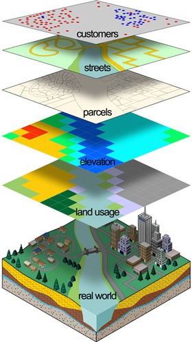 A graphic showing different types of geo-spatial modelling in relation to the "real world"  An example of geovisualization An example of geovisualization Next, we have the work of Daniel Sui and James Holt, who researched how maps are used in the depiction of "public-health data". The two believe that cartograms, maps that distort true geographic size to a size proportional to a given statistics, are thematic maps that can only be embraced as such if three research paradigms are considered: Map as an Image: This paradigm focuses on the visual aspects of maps, including colors and symbols. The main idea in this area of research is to look at how successful maps are in communicating information to their audience. Map as a Model: This paradigm is based on the use of maps to analyze information. Maps aren't seen as images or art but rather tools for researchers to use to understand data. In this area, maps are used as a means of problem-solving. Map as a Social Construction: This paradigm cites the fact that maps, even if unintended, show a certain perspective in their representation. They create a reality separate from the phenomena modeled after. This means that maps are tools of power and must be separated from other forms of visual imagery. The practice of critical cartography resides in this paradigm. *I'm not sure if you noticed, but each of these paradigms aligns with one of the three "traditional components" discussed above. It's amazing to see how ideas line up to form a narrative! Then, Fernández discusses Michael Peterson and his research in the relationship between paradigmatic shifts in cartography and the internet. Peterson recognizes four paradigms in cartographic research, but for the sake of the length of this blog, I will only be mentioning the most important (the others have already been mentioned to some extent). Peterson saw the use of the internet in cartographic research as a major paradigm shift, as researchers saw the potential directions that the field could take with the new tools and technologies available. Furthermore, Peterson states that the internet can impact the paradigms mentioned above by changing our approach to maps. This is controversial to Kuhn's theory (in the idea of the independence of paradigms) and could change how researchers view maps epistemologically. Continuing on, several researchers worked to define and develop the concept of "geovisualization". Geovisualization is the process of using maps (or similar displays) to visualize geographic information, which can then be used for further analysis. This practice arose when lead researchers, such as Alan MacEachren, realized that maps are used for much more than simply communicating results in the scientific community. Instead, maps could be integrated into different phases of the scientific process, such as hypothesis development (Çöltekin et al.). Alan MacEachren discusses our epistemological approach to maps in his book "How Maps Work". Now, before I start discussing the points made about MacEachren in the dissertation, I wanted to say that his book seems very interesting. From what I have read, it is a great resource for anybody who aims to learn more about contemporary cartography, and specifically, what makes a map successful. It is definitely on my reading list! Anyway, MacEachren focuses on, as is said in his book title, "how maps work". This means he looks at how maps can be used to communicate information, which can then be utilized in scientific research. I had to do some research to understand this topic, but I think I have finally grasped it. So, MacEachren supports a "semiotic-cognitive approach" to cartography. This looks at both how maps communicate information and how our brains interpret said information. To illustrate this concept, MacEachren created a "cartographic cube", which I have inserted below. 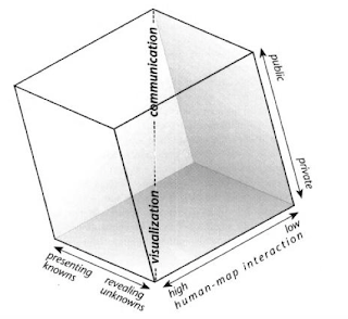 The cube contains three axes that together represent MacEachern's interpretation of geovisualization. First, there's the public/private axis. Public refers to using maps to share information with a wider audience and coincides with communication. On the other hand, private refers to the individual using maps to develop hypotheses and to analyze information, which is connected to visualization. Next, human-map interaction is the level to which humans can interact with maps. When it is high, we are able to manipulate maps in order to use them in our own cognitive thinking. However, low interaction means that we have little to no ability to manipulate the information and are simply receiving a representation of spatial data. Lastly, presenting knowns connects to communication and is using maps to display collected information that is already known. Revealing unknowns are used in visualization when maps are used to analyze or hypothesize (Jeroen, 2015). Below, I have included some more examples of geovisualization in practice because who doesn't love some cool maps.  Another contributor to geovisualization is David Dibiase. He focuses on “visual communication” and “visual thinking”, and their role in scientific research. Dibiase created a foundation for MacEachren's later additions to geovisualization, so his work is important to note. Here is a graphic showing Dibiase's interpretation. Dibiase uses similar ideas, but the process is more linear rather than a cube. Also, while MacEachren created a three-dimensional display of visualization and its use in maps, Dibiase saw visualization as essentially the same as cartography. (Jeoren 2015). The rise of GIS has facilitated geovisualization, and the power of maps in cognitive thinking and science has greatly increased. Over time, geovisualization has transformed into “geovisual analytics”, which focuses on using maps to analyze scientific data. Subsequently, the idea of "cybercartography” was introduced by David Fraser Taylor in 1997. Fraser Taylor recognized that maps had the potential to aid society greatly in the age of technology, but in order for this to happen, a new paradigm must arise. He noticed that the previous paradigm had revolved around the scientific aspect of maps, but Fraser Taylor wanted to expand this focus to include art. This would widen the scope of maps to more areas of society, and the use of technology would allow this to happen. With cybercartography, “map users can become creators” (Fernández 90). This means more people could participate in the production of maps that combine information and aesthetics. This new paradigm allowed cartography to evolve into a less formalized practice that could attract the interest of a greater audience. Here are some examples of more aesthetically-focused maps: 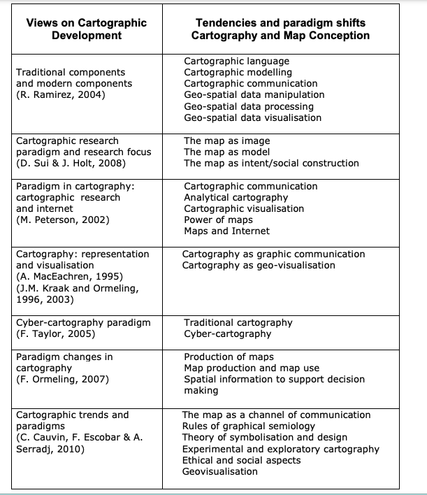 Now, I am going to talk about paradigms in cartography. Ferjan Ormeling has performed research in this area, and Fernández highlights some of his contributions. Ormeling studied how the definition of cartography has changed over time. Below are three different definitions:
1820: the production of maps 1960: the communication of spatial information 1980: the production and use of maps As you can see, the definition has evolved as our epistemological understanding of the field has expanded. The scientific aspect of cartography is more prevalent in later definitions, which coincides with what we have already learned about the history of cartography (Fernández 78). Ormeling also notes the importance of technology in changing the field of cartography. Once maps are produced digitally, we can now easier analyze the data presented. This is analytical cartography, which is connected to GIS. Additionally, maps could now be stored in a digital file that allowed easier access to specific information. This facilitated our ability to analyze maps in order to reach certain goals. In other words, "it was possible to separate the storage function from the communication function of the map" (Ormeling 2007). So, Fernández mentions three paradigms that correlate with Ormeling's research. The first is "map production". This is followed by "map production and map use" when maps began to be used in more complex and analytical ways. Lastly, "spatial information to support decision making" describes the ability to separate the "storage function" of a map from its "communication function". We have now arrived at the final part of section 4. Here, Fernández discusses "cartographic trends and paradigms since 1950". Colette Cauvin, Francisco Escobar, and Aziz Serradj researched trends in cartography, which they shared in their book entitled “Thematic Cartography and Transformations”. They divided cartography from 1950 to 2009 into three periods, and each had some notable paradigms. 1950-1975: This period had two paradigms, “the map as a channel of communication” and the “rules of graphical semiology”. These focused on how maps are used to communicate information and defined the language of cartography. The period ended in 1975 with the Vienna Congress where theoretical cartography began to flourish. 1975-1995: This period had three paradigms, “theory of symbolization and design”, the “experimental and exploratory cartography” and, the “inclusion of ethical and social aspects”. All of these paradigms focus on theoretical cartography and how the use of maps could be expanded beyond simple, unbiased communication (it never really was this). Moreover, the situation in which maps were produced was considered. Lastly, the "exploratory" form of cartography transformed maps into a tool for analysis and hypothesis development. During this period, digital mapping arose, which further transformed the map's functionality. 1995-2009: This period has one paradigm, which is "geovisualization". I know I already talked about this topic above, but here, I am going to discuss the changes that allowed this shift to occur. GIS and cartography connected to allow maps to be produced in new, exciting ways. Furthermore, rather than being used to communicate, maps became forms of research and "scientific visualization". Scientists could now interact with maps to reach conclusions regarding spatial data. Below is a chart displaying cartographic trends starting in the 1950s. That wraps up this week's blog post. I feel like I have such a greater understanding of cartography now, and it's amazing to see how the practice has transformed over time. Next week, we will arrive at the greatly anticipated topic of critical cartography. I cannot wait to learn about this, and I hope you are as excited as I am. I may be going out of town next weekend, so a delay in my posting may occur, but I will get it out as soon as possible.
0 Comments
Leave a Reply. |
Archives
September 2021
Categories
|
 RSS Feed
