|
Hi and welcome back to my blog! This week, my post is going to be a bit different than recent posts. Today, I am talking about map memorization and our brain's cognition of space.. This topic is definitely less philosophical than my recent posts, but it is nonetheless intriguing (to me at least). I am hoping to keep this post short and sweet, so let's jump right in. A fun fact about me is that I know not only the fifty states and capitals of the US but also every country of the world, including their capitals and flags (kinda unrelated but still geographically focused). Furthermore, memorizing maps is actually what spurred my interest in cartography and what made me decide to write this blog. Once I realized my aptitude for spatial memorization, I became extremely curious about how maps work in our society.  So, let's start with some background information regarding the human brain and spatial orientation. Some people say that they are horrible with directions, and while that may be true to some degree, everyone has an innate ability to navigate the world. Think about your house for example. If you are up in the middle of the night and it is dark, are you able to navigate through your house without turning on a light? Sure, you might step on a stray object lying around, but chances are you won't run into any walls. However, if you were to do the same thing in a stranger's house, you probably would run into some walls or at least walk much slower to find your way around. This is spatial orientation at its finest. You may be asking yourself, how can my brain do this? Well, a group of scientists actually won the Nobel Prize in Physiology or Medicine in 2014 for answering this question. John O'Keefe, May-Britt Moser, and Edvard I. Moser discovered different types of nerve cells in the brain that we use as an "inner GPS" to navigate the world around us. In 1971, O'Keefe discovered nerve cells in a region of the brain known as the hippocampus that become activated when we are in a certain place, also known as "place cells". Later in 2005, May-Britt and Edvard Moser discovered "grid cells" that allow the brain to position itself through specific coordinates that these cells generate. Together, these cells allow our brains to create maps within our minds of the world. Additionally, as mentioned above, the hippocampus is an integral part of this process, but there are other regions involved, as shown in the diagram below. 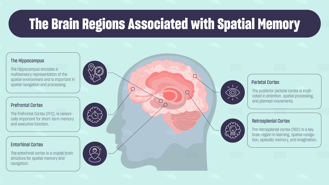 I know that this information may seem negligible when discussing maps of the world because no human has ever seen every part of the globe or will have to navigate it in this capacity. However, these mechanisms are important when considering spatial memory— an essential aspect of memorizing maps. Now that you have a general understanding of the process of spatial memorization in the brain, I'm going to explain the process that I used to memorize the map of the world. I am not going to lie and say it was easy, but it is definitely possible with enough effort. Also, just to prove that I actually know both the countries and their capital cities, here are the results of two online quizzes that I took recently. While it may seem daunting to memorize 196 countries and capitals, I actually find it easier than memorizing vocabulary or random facts. Unlike words, you can actually picture the map in your head and connect the names to a concrete location in the world, which I found extremely useful in the memorization process. Now, whenever I need to think of the location of a specific country, all I have to do is picture the map of the world in my head and zero in on said country. So here are the general steps I took on this journey of memorization:
I hope that you enjoyed this blog post. While this was definitely more laid back than my previous posts, it is arguably more practical in the real world. If you have read my previous blog posts, you will know that there is definitely something to be said about the common representation of the world through maps, but it is still fun to test your mind in new ways. Be on the lookout for my next blog post, which will be discussing maps across different disciplines.
0 Comments
Hello and welcome back to my blog! I am so sorry for not posting for such a long time. Unfortunately, my laptop screen decided to break (seriously I didn’t do anything to break it) before I had finished writing this post. I was so close to being finished, but I had to wait until I could get my hands on a laptop to add some final touches, which is why this is coming so late. I promise it’s worth the read though. Today, I will be discussing the long-awaited section 5 in Pablo Iván Azócar Fernández's dissertation. This section is titled "Critical Cartography in the Context of Post-Modernism", and I have been waiting to bring up this topic in greater detail for quite some time, and the fact that it is paired with postmodernism makes it even more exciting. I don't want to ramble on too long with this introduction, so I am going to jump right into the content. The emergence of critical cartography coincided with the epistemological shift away from positivism and into postmodernism in the 1980s. Additionally, it can be placed in the larger category of postmodern cartography. This form of cartography cannot necessarily be defined by a specific style or perspective but by what it is not. That is, postmodern cartography aims to break away from modern cartography and challenge its practices and ideas. If you know anything about postmodernism in other disciplines, like literature, the same trends can be seen there. The goal of this school of thought was to criticize its predecessors and form novel perspectives. According to Nikolas Huffman, postmodernism can be broken down into four main components that separate it from modernism. These are "postmodern style in architecture, art, and literature; postmodern social theory; the political economic of late capitalism and; poststructural philosophy" (Fernández 85). The most important in the context of cartography are post structural philosophy and postmodern social theory. For more information on the general theories of postmodernism, check out my first blog post regarding the dissertation. However, the postmodern style should also be considered. Like other forms of expression (ie. architecture), postmodernist cartographers challenged the conventional method of producing and interpreting maps. In architecture, this was seen in the shift from "form follows function" to "function follows form". As a result, more creative feats of architecture emerged that previous architects would have never considered due to the “rules” of architecture. The same can be said for cartography. Maps were no longer seen as "mirrors of reality", and the scientific and methodical approach to mapping was questioned. By not attempting to show a perfect reflection of the world, maps became more engaging and thought-provoking, and as a result, people began to realize the bias inherent in cartography. Most importantly, maps were now seen as powerful tools that could reveal social problems and be used to assert dominance over certain groups of people. With this idea, critical cartography arose. Critical cartography aims to introduce social analysis into maps that were created for scientific purposes. These maps, often seen as unbiased, were viewed under a new light, and aspects that were previously left unconsidered became the focal point of research. Essentially, critical cartographers took maps and examined how they demonstrate power relationships in society. A major component of critical cartography is the "production of space". When maps are made, they establish spatial relationships. Locations have names and categories and boundaries that do not exist if you were to walk out in the real world. For instance, state borders do not concretely exist. They are simply imaginary lines created by our ancestors to exert their authority. When looking at this "production of space", critical cartography recognizes the link between geography and political power. That is, maps reside in the realm of politics. For example, all three maps below represent United States in different periods of times (although some were not necessarily established maps at the time). This goes to show how politics and a nation's power influence how maps are made. It should also be noted that the point of critiquing maps is not to invalidate the information they display. Instead, the aim is to understand why the map looks the way it does and to seek possible alternatives to what is displayed. Two goals of critical cartography are to examine the social aspects of maps and to allow access to cartography to a wider range of people, also known as "open-source" cartography. Cartography remained an academic practice for a long time, but critical cartographers have brought this issue to light. They advocate for "undisciplined cartography" that the general public can engage in. This practice has allowed new, intriguing perspectives of space to be portrayed through maps. Denis Wood and John Krygier are two critical cartographers that have studied cartography within a historical context. In their research, the two have found that criticism has always existed in the field of cartography, but it was not formally recognized until critical cartography arose in the 1980s. One example they note is Mercator's map, which is a critique of previous maps made with "Ptolemaic and Conical projections". However, Mercator's projection was later criticized by cartographers producing new styles of mapping the world. Wood and Krygier have also recognized criticism within the field of cartography. Cartographers have often questioned the epistemologies and methodologies in the field. This can be seen in the shift from seeing cartography as an exact, unbiased science to a source of power and deceit. There has also been criticism outside of the field. This comes largely from indigenous communities that have lost traditional territories due to maps made by powerful groups. This is seen in a practice known as "counter-mapping", which gives communities the ability to produce their own maps that "counter" those made by traditional cartographers. I am going to make a whole blog post on this topic, but for now, I'll give you a short example. The indigenous peoples of Brazil were stripped of their territorial claims when Europeans colonized the land. One group, known as the Munduruku, used the process of counter-mapping in order to reclaim their ancestral territory in Brazil and protect it against the threat of dam construction. Olga Paraskevopoulu, Dimitris Charitos and Charalampos Rizopoulos point out several examples of projects that challenge cartography in "“Location-Specific Art Practices the Challenge the Traditional Conception of Mapping”. First, Urban Tapestries was a project conducted in 2002 by Proboscis that combined GIS, mobile devices, and public knowledge of urban areas. The project worked to allow people to convey information related to a specific theme outside of geographic location. This incorporated social aspects of cities into maps and allowed the general public to produce maps and routes. Bio Mapping is a project run by Christian Nold to create emotional maps of different areas. This involved using a device to measure a person's "galvanic skin response (GSR)" in various locations throughout a city. GSR determines the user's emotional levels while in a certain area, and then, a map is created to show the rise and fall of someone's emotions as they see and experience various places.  Map of population by county in the United States Map of population by county in the United States Both of these projects introduce new elements into cartography that have not traditionally been used. In doing so, a broader understanding of a geographic location is produced that goes beyond a coordinate on a map. If you recall one of my first ever blog posts, “A New Perspective of Cartography”, then you may remember the different forms of cartography that I discussed. These were in no way “traditional”, but they played a similar role as geographic maps. "Map mashups" are another form of cartography that adds a layer of complexity to traditional practices. This style of mapping is often employed when mapping a crisis to display various levels of geographic information. To create these maps, one starts with a "base layer" that is simply showing a geographic location. Then, a "operational layer"is added that is essentially the main idea of a map (something like average income per household). Several "operational layers" can be combined to show complex information regarding a certain area (Esri Press Team) Below is a chart detailing new mapping practices that display critical cartography  Another aspect of critical cartography is the view of maps as "social constructions". This means that they are no longer unbiased "mirrors of the world" but actually show information within a social context. In this way, maps can be compared to written works, which contain subtext and underlying motives that can be used as a tool for analysis. John Harley proposed a shift in the "the way of interpreting the nature of cartography." That is, a shift in how we think of how and why maps are made (Harley). If maps can be compared to text, then they can also be "deconstructed" like written work. When examining literature, we often attempt to break it down in order to find a deeper meaning and hidden details in the subtext. Deconstruction coincides with postmodernism in the way the nuances of a text are put into larger consideration than the actual words on the page. In 1989, John Harley developed a strategy for deconstructing maps. Harley took inspiration from Michel Foucault and his idea of "discourse", which Fernández defines as "a system of possibility for knowledge." To be honest, this concept is kind of hard for me to understand and explain, but I will try my best to break it down. Discourse refers to written or spoken knowledge and essentially takes the social context in which "knowledge" is composed into consideration. It determines ways of communicating reality within a social context, so therefore, it constitutes what we define as knowledge. Harley connects "discourse" to "rules" in cartography. Below is a model depicting this idea  There are essentially two domains in which the rules of cartography fall: social and scientific. Scientific rules are those concerned with the methods used to create maps—think measurements and symbols. Social rules fall under two classifications: "social order" (hierarchy) and "ethnocentrism". These rules show the relationship between maps and power throughout history and display the cultural aspect of maps. The scientific and social rules are interconnected in maps and play an important role when considering deconstruction. Moreover, in deconstructing a map, cartographers must look beyond the information presented on the surface to find subtleties and reveal metaphors hidden in the cartographic language. When looking at “normal” maps (science-based), the “ scientific facts” displayed can become metaphors . Another component of deconstruction is understanding “rhetoric”. In analyzing a map, it is important to take into account the nature of maps to act as instruments of persuasion. They attempt to communicate information in a persuasive and intriguing manner that words or numbers alone cannot achieve. The rules of cartography and rhetoric demonstrate how maps are a “social construction” rather than purely scientific, as was once the consensus. This change in thinking can be seen as a paradigm shift that facilitated the emergence of critical cartography. To build on this idea, the power of maps should also be considered. If you think back to the age of imperialism when nations were fighting to claim as much land as possible, maps decided who got what territories. With this, the native peoples who had inhabited the land for years were cast aside as if they did not exist, and their claims were essentially erased from the “map”. Furthermore, maps can be used as tools for planning and strategizing, as they offer a different perspective of land that can’t be obtained by the human eye alone. John Harley was a leader in the understanding of the power of maps, and helped to lay a foundation for future researchers. Below is a chart similar to the one included above to display Harley’s ideas of power in cartography.  According to Harley, there are two types of power in cartography. External power is what most people would initially think if they were asked to explain the power of maps. This power is “centralised” in the hands of the leaders of a nation or group, which involves exercising power “on cartography” and “with cartography”. “On cartography” refers to the creator's ability to manipulate the image of a map to favor their interests. On the other hand, “with cartography” explains how power can be exerted using maps, such as through a territorial claim.
Conversely, the internal power in cartography is not as obvious. It refers to “the political effects of what cartographers do when they make maps” (Fernández 102). Whenever a cartographer produces a map, power is created, whether that is intentional or unintentional. Furthermore, power is derived from maps. This is largely due to the “cartographic process” that allows the cartographer to display their version of reality. As a result, the world is “normalized”. Here’s a paragraph from the dissertation that does a great job of summarizing this idea: From an epistemological viewpoint, Harley pointed out that, whilst the map is never the reality, it helps to create a different reality. Once embedded in the published text, the lines on the map acquire authority. Thus, maps are authoritarian images, and even without the users being aware of it, a map can reinforce and legitimize the status quo inside of a society. I know that this was a very information-heavy blog post, but I hope you found it as interesting as I did. It’s so intriguing to see how seemingly innocent objects, like maps, can be used to wield so much power. We don’t think about it, but we put so much trust into maps that we would be lost (literally) without them. Think of the last time you were traveling somewhere and didn’t pull out a map of some sort to find your way around. This map was probably filled with borders and names and symbols that are generally looked past. However, I hope that after reading this, you will reconsider the contents of the next map you see. Now, I wanted to give you a glimpse into the future of the blog. I have decided to stop writing about the dissertation because I wanted to expand my blog to cover some more topics. Moving forward, my posts will be shorter and focused on easily understandable topics, as I don’t have an abundance of time to write at the moment. I will try to be consistent, but I can’t make any promises. I hope you come back for my next blog post! I’m back with a new blog post, and I actually posted two weeks in a row! This proved quite difficult, as a tropical storm decided to come yesterday, and I lost power for some time, but I persevered through these challenges and delivered a new post. This week I will be discussing section 4 of "Paradigmatic Tendencies in Cartography: A Synthesis of the Scientific-Empirical, Critical and Post-Representational Perspectives" by Pablo Iván Azócar Fernández, but before I do that, I have an exciting announcement. I have decided to move my blog onto a new platform that better caters to my needs as a blogger, so be on the lookout for more information regarding this. If you are worried about losing all of this precious information, don't fear. I will be transferring everything over. Now, let's move on and discuss today's topic. Section 4 is titled "Tendencies in Contemporary Cartography", and it focuses on just what the title says. However, to be a bit more thorough than that, Fernández dives into the patterns that emerged in the field of cartography in the second half of the twentieth century when it became a more prominent area of study. It also builds on the paradigm concept from the previous post by illustrating the idea from a cartographic lens. Each subsection focuses on a different researcher, the first of which being Raul Ramirez. Raul Ramirez wrote a book draft titled "Theoretical Cartography" in which he highlights the three "traditional components" of theoretical cartography. These components are the different approaches that researchers use when studying theoretical cartography. They are "the linguistic direction, the modeling direction, and the communication direction". Together, these aspects explain cartography in its role as a scientific field and allow us to understand the elements of maps. Linguistic Direction: This basically means that cartography is a form of language, and just like English or Spanish, it is composed of "alphabet, grammar, reading, and writing." This language can be used to describe spatial relationships. I wanted to go into more depth than was discussed in the dissertation, so I found a paper titled "Modern Cartographic Language" by Zhao et al. that looks at what exactly is meant by cartographic language. According to the paper, cartographic language can be defined by the use of symbols to convey geospatial information to a reader. These symbols are divided into three general categories of "visual symbols, auditory symbols, and tactual symbols". Visual symbols are what we traditionally think of as cartographic symbols. They appear on maps as images or words that represent a certain feature on the map. However, this also includes videos that sometimes appear in modern, online maps. Auditory symbols involve sound, like background music or spoken words, to describe spatial relationships. Lastly, tactual symbols are relationships perceived by touch. These are more specific to maps designed for blind or visually impaired people, but it also includes the little bumps on globes where mountains are.  A chart showing the different elements of cartographic language (Kraak and Ormeling 1996) Modeling Direction: Modelling is the process of making maps a visual representation of certain phenomena, especially those of geospatial concern. The four components of this idea are "generation of the model, analysis, interpretation, and evaluation." With this, there is the necessity of laws that govern how maps are produced in order to present models that are understandable to the common person. Communication Direction: Maps are created as a mode of communication to a certain audience. It is very rare that someone makes a map without intentions of sharing some sort of information. In this, the inherent bias in maps must also be considered, as with communication, there must be someone presenting the information and interpreting the same information. These two processes can contradict each other in their intentions, so this is important to note. Those were the traditional components of maps, but Ramirez also named the "modern components" that take the technological movement in cartography into account. These components are: Geo-Spatial Data Manipulation: How maps represent geospatial phenomena. This accounts for the ways in which cartographers can choose how the readers see the space they are showing in their maps and considers a map's tendency to be inaccurate. Geo-Spatial Data Processing: How maps are analyzed to determine what was the intended representation and what was the actual representation. This includes the methodologies used to analyze maps Geo-Spatial Data Visualization: How maps are displayed to the reader. Different forms of mapping have emerged that use different visual representations to portray ideas to the reader. Many cartographers have conducted conceptual studies in this area in order to develop new ways of sharing spatial data. 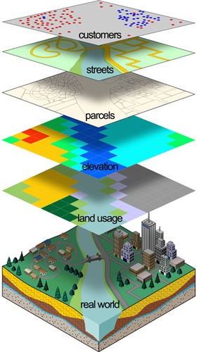 A graphic showing different types of geo-spatial modelling in relation to the "real world"  An example of geovisualization An example of geovisualization Next, we have the work of Daniel Sui and James Holt, who researched how maps are used in the depiction of "public-health data". The two believe that cartograms, maps that distort true geographic size to a size proportional to a given statistics, are thematic maps that can only be embraced as such if three research paradigms are considered: Map as an Image: This paradigm focuses on the visual aspects of maps, including colors and symbols. The main idea in this area of research is to look at how successful maps are in communicating information to their audience. Map as a Model: This paradigm is based on the use of maps to analyze information. Maps aren't seen as images or art but rather tools for researchers to use to understand data. In this area, maps are used as a means of problem-solving. Map as a Social Construction: This paradigm cites the fact that maps, even if unintended, show a certain perspective in their representation. They create a reality separate from the phenomena modeled after. This means that maps are tools of power and must be separated from other forms of visual imagery. The practice of critical cartography resides in this paradigm. *I'm not sure if you noticed, but each of these paradigms aligns with one of the three "traditional components" discussed above. It's amazing to see how ideas line up to form a narrative! Then, Fernández discusses Michael Peterson and his research in the relationship between paradigmatic shifts in cartography and the internet. Peterson recognizes four paradigms in cartographic research, but for the sake of the length of this blog, I will only be mentioning the most important (the others have already been mentioned to some extent). Peterson saw the use of the internet in cartographic research as a major paradigm shift, as researchers saw the potential directions that the field could take with the new tools and technologies available. Furthermore, Peterson states that the internet can impact the paradigms mentioned above by changing our approach to maps. This is controversial to Kuhn's theory (in the idea of the independence of paradigms) and could change how researchers view maps epistemologically. Continuing on, several researchers worked to define and develop the concept of "geovisualization". Geovisualization is the process of using maps (or similar displays) to visualize geographic information, which can then be used for further analysis. This practice arose when lead researchers, such as Alan MacEachren, realized that maps are used for much more than simply communicating results in the scientific community. Instead, maps could be integrated into different phases of the scientific process, such as hypothesis development (Çöltekin et al.). Alan MacEachren discusses our epistemological approach to maps in his book "How Maps Work". Now, before I start discussing the points made about MacEachren in the dissertation, I wanted to say that his book seems very interesting. From what I have read, it is a great resource for anybody who aims to learn more about contemporary cartography, and specifically, what makes a map successful. It is definitely on my reading list! Anyway, MacEachren focuses on, as is said in his book title, "how maps work". This means he looks at how maps can be used to communicate information, which can then be utilized in scientific research. I had to do some research to understand this topic, but I think I have finally grasped it. So, MacEachren supports a "semiotic-cognitive approach" to cartography. This looks at both how maps communicate information and how our brains interpret said information. To illustrate this concept, MacEachren created a "cartographic cube", which I have inserted below. 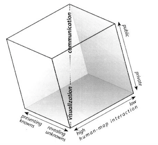 The cube contains three axes that together represent MacEachern's interpretation of geovisualization. First, there's the public/private axis. Public refers to using maps to share information with a wider audience and coincides with communication. On the other hand, private refers to the individual using maps to develop hypotheses and to analyze information, which is connected to visualization. Next, human-map interaction is the level to which humans can interact with maps. When it is high, we are able to manipulate maps in order to use them in our own cognitive thinking. However, low interaction means that we have little to no ability to manipulate the information and are simply receiving a representation of spatial data. Lastly, presenting knowns connects to communication and is using maps to display collected information that is already known. Revealing unknowns are used in visualization when maps are used to analyze or hypothesize (Jeroen, 2015). Below, I have included some more examples of geovisualization in practice because who doesn't love some cool maps.  Another contributor to geovisualization is David Dibiase. He focuses on “visual communication” and “visual thinking”, and their role in scientific research. Dibiase created a foundation for MacEachren's later additions to geovisualization, so his work is important to note. Here is a graphic showing Dibiase's interpretation. Dibiase uses similar ideas, but the process is more linear rather than a cube. Also, while MacEachren created a three-dimensional display of visualization and its use in maps, Dibiase saw visualization as essentially the same as cartography. (Jeoren 2015). The rise of GIS has facilitated geovisualization, and the power of maps in cognitive thinking and science has greatly increased. Over time, geovisualization has transformed into “geovisual analytics”, which focuses on using maps to analyze scientific data. Subsequently, the idea of "cybercartography” was introduced by David Fraser Taylor in 1997. Fraser Taylor recognized that maps had the potential to aid society greatly in the age of technology, but in order for this to happen, a new paradigm must arise. He noticed that the previous paradigm had revolved around the scientific aspect of maps, but Fraser Taylor wanted to expand this focus to include art. This would widen the scope of maps to more areas of society, and the use of technology would allow this to happen. With cybercartography, “map users can become creators” (Fernández 90). This means more people could participate in the production of maps that combine information and aesthetics. This new paradigm allowed cartography to evolve into a less formalized practice that could attract the interest of a greater audience. Here are some examples of more aesthetically-focused maps: 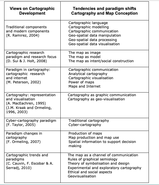 Now, I am going to talk about paradigms in cartography. Ferjan Ormeling has performed research in this area, and Fernández highlights some of his contributions. Ormeling studied how the definition of cartography has changed over time. Below are three different definitions:
1820: the production of maps 1960: the communication of spatial information 1980: the production and use of maps As you can see, the definition has evolved as our epistemological understanding of the field has expanded. The scientific aspect of cartography is more prevalent in later definitions, which coincides with what we have already learned about the history of cartography (Fernández 78). Ormeling also notes the importance of technology in changing the field of cartography. Once maps are produced digitally, we can now easier analyze the data presented. This is analytical cartography, which is connected to GIS. Additionally, maps could now be stored in a digital file that allowed easier access to specific information. This facilitated our ability to analyze maps in order to reach certain goals. In other words, "it was possible to separate the storage function from the communication function of the map" (Ormeling 2007). So, Fernández mentions three paradigms that correlate with Ormeling's research. The first is "map production". This is followed by "map production and map use" when maps began to be used in more complex and analytical ways. Lastly, "spatial information to support decision making" describes the ability to separate the "storage function" of a map from its "communication function". We have now arrived at the final part of section 4. Here, Fernández discusses "cartographic trends and paradigms since 1950". Colette Cauvin, Francisco Escobar, and Aziz Serradj researched trends in cartography, which they shared in their book entitled “Thematic Cartography and Transformations”. They divided cartography from 1950 to 2009 into three periods, and each had some notable paradigms. 1950-1975: This period had two paradigms, “the map as a channel of communication” and the “rules of graphical semiology”. These focused on how maps are used to communicate information and defined the language of cartography. The period ended in 1975 with the Vienna Congress where theoretical cartography began to flourish. 1975-1995: This period had three paradigms, “theory of symbolization and design”, the “experimental and exploratory cartography” and, the “inclusion of ethical and social aspects”. All of these paradigms focus on theoretical cartography and how the use of maps could be expanded beyond simple, unbiased communication (it never really was this). Moreover, the situation in which maps were produced was considered. Lastly, the "exploratory" form of cartography transformed maps into a tool for analysis and hypothesis development. During this period, digital mapping arose, which further transformed the map's functionality. 1995-2009: This period has one paradigm, which is "geovisualization". I know I already talked about this topic above, but here, I am going to discuss the changes that allowed this shift to occur. GIS and cartography connected to allow maps to be produced in new, exciting ways. Furthermore, rather than being used to communicate, maps became forms of research and "scientific visualization". Scientists could now interact with maps to reach conclusions regarding spatial data. Below is a chart displaying cartographic trends starting in the 1950s. That wraps up this week's blog post. I feel like I have such a greater understanding of cartography now, and it's amazing to see how the practice has transformed over time. Next week, we will arrive at the greatly anticipated topic of critical cartography. I cannot wait to learn about this, and I hope you are as excited as I am. I may be going out of town next weekend, so a delay in my posting may occur, but I will get it out as soon as possible. Hi and welcome back! I know that this post is coming a little later than promised, but it's better late than never. My summer has been a little busier than anticipated so far, and I honestly just needed to step away from technology for a little while after a year full of it. However, I am back now and ready to bring another blog post about Fernández's dissertation. This week, I will be discussing section 3. I will not be discussing section 4 because I found the information to not really make sense when presented together, so section 4 will be featured next week. Section 3 builds off of the theoretical framework established in the prior section and helps to further explain the development of critical cartography. Without further ado, let's get into some mind-boggling information! So, section 3 focused on "Paradigms in the History of Science". If you recall, the research objective and question from section 2 were also used in section 3. As a refresher, these are as follows: Does the development of cartography have epistemological and philosophical bases like other scientific disciplines? and To analyze the philosophical and epistemological bases of cartography during its contemporary development. The following section adopts a different approach, but this will be introduced later. Section 3 is based on Thomas Kuhn's "paradigm concept". According to Fernández, a paradigm is "a scientific community in a defined field which shares common aims and criteria during a certain period of time" (Fernández 47). Furthermore, when a paradigm undergoes a period of change, this is known as a "scientific revolution". Basically, paradigms are the common ideology and methodology within a certain period of time and define how scientists approach and discuss problems. Another concept developed by Kuhn is the "incommensurability concept" which states that paradigms are independent of each other, and therefore, pieces of different paradigms cannot be applied outside of the realm of their time period. The concept of paradigms is used in epistemological contexts, as they can be used to define scientific thinking during different time periods. Within this broad definition, paradigms can be applied to both "historical" and "social" circumstances when exploring epistemology. One of Kuhn's major ideas is known as the "disciplinary matrix". To break this down, "disciplinary" refers to commonalities among professionals within a certain area of study or discipline. "Matrix" means that there are multiple aspects that join together. So, if you put these two ideas together, the term means the different components, like values, of a certain social group (Orman 48). Kuhn referred to a change in paradigms as a "paradigm shift". Paradigms are built around scientific discoveries in a given time period, so a shift is inevitable when a monumental discovery is made. Prior to an "anomaly", scientists enjoy a period of "normal science" where certain ideas and research objectives are shared among the general scientific community. Then, "scientific revolutions" occur and allow scientific thought to enter a new paradigm founded upon different beliefs. In each paradigm, different methodologies, philosophies, and central issues emerge. These core components lead the scientists' research, and it becomes their job to use the paradigmatic ideas to solve puzzles. Paradigms can also be referred to as "world views", meaning the epistemological or philosophical way of thinking during a certain point in time, and they can be used to explain progress throughout history. Below is a chart that shows paradigm shifts in different fields of science to further illustrate the concepts discussed so far.  If I'm being honest, I don't know what a good portion of these exactly are, but for those who do, this probably makes even more sense. However, the general idea is shown that new paradigms coincide with the emergence of revolutionary theories that change our way of seeing the world. I thought it would be interesting to think of my own paradigm shift, so here it goes. When I started thinking about this, my mind immediately went to biology because we learned about several revolutionary discoveries this year. The first example that came to mind was how living things are generated. Prior to a major experiment that changed the scientific theory, it was widely believed that life could arise from non-living things. This theory was known as abiogenesis. However, in 1858, Louis Pasteur conducted several experiments to prove that life could only come from living things. This marked the beginning of a new paradigm in biology and evolution. The theory of biogenesis spurred a new age of experimentation in this field of science and led to further developments that used ideas established in this shift. I also wanted to include an example in cartography (I will be going into more depth about cartography later) for obvious reasons. While there are several instances that can be recognized as paradigm shifts, I wanted to highlight the introduction of satellites into the discipline. Prior to satellites, cartographers could only see the world from within the confines of our planet, but ever since the first satellite was launched into orbit, cartographers can more accurately map our world. They also allowed us a new world view, changing cartographic approaches and methodologies like never before. If you want to learn more about this topic, visit my earlier blog post titled "Technology's Impact on Map-making". While paradigms describe history, they also are relevant in examining social aspects of the scientific community. Scientists within a certain discipline often share similar approaches and beliefs that frame their work as a whole during a period of "normal science". I now want to return to the "incommensurability concept" mentioned earlier. This is the idea that a new paradigm is "incompatible" with the old paradigm. This is especially true when thinking about the meaning of various words and phrases. A word may mean one thing in one paradigm but take on a completely different definition in another, so it is impossible to apply a word that appears in both in different contexts than that which it originates. Lastly, paradigms are important in looking at the development of society. Paradigm shifts coincide with changes in viewing the world, so when this occurs, people see their surroundings in a different light than before and can approach problems differently. This is important in philosophy and epistemology when trying to understand different perspectives throughout history. As with all sciences, paradigms can be seen in geography and cartography. However, there has been some debate as to whether they actually exist in the discipline. Below I will show two charts to demonstrate the conflict. The first chart shows different paradigms in geography throughout history. Several of these were discussed in my last post, so you should be pretty familiar with these at this point. However, Horacio Capel reached an interesting conclusion when thinking about geographic paradigms. Capel questions whether paradigms exist in geography, as the foundation of ideology in the field moved like a "pendulum" throughout the nineteenth and twentieth centuries between the major, conflicting belief systems of positivism and historicism. Capel argues that there were no large shifts in thinking but simply movement between two principal ideas, which would deviate from Kuhn's paradigm concept. I'll leave you to decide whether paradigms exist in geography, but now, I have to wrap up this post.
To bring all of this information together, Thomas Kuhn developed his "paradigm concept" when looking at changes in thinking over time. Paradigms describe the general ideology and methodology within a given discipline or social group during a period in history, and when a major event occurs that challenges the foundation of our knowledge, a paradigm shift occurs. This allows the transition into a new era of thinking, perception, and discovery. There is some debate over whether geography/cartography can fit into this model due to the pendulum-like movement between theories, but specific instances can certainly be recognized to support the existence of paradigms in the discipline. I know in the previous post I said that I would be combining two sections from now on, but honestly, I think this worked out much better than that would have. I was able to go into greater detail regarding section 3, and the topics didn't get muddled together. Consequently, I am going to continue this strategy from now on. Also, I am going to try very hard to upload another post next week, but you never know what will happen. Hi and welcome back to a new blog post! I am officially finished with school for the summer, so I will have more time to post over the next three months. That means many more blog posts are coming your way filled with an array of fascinating information. Now, I know that I said that I was going to talk about critical cartography in this post, and I promise that is coming. However, when I was researching the topic, I found a dissertation that included the concept of critical cartography in a wider context, and to be honest, I fell down a rabbit hole. "Paradigmatic Tendencies in Cartography: A Synthesis of the Scientific-Empirical, Critical and Post-Representational Perspectives" by Pablo Iván Azócar Fernández essentially discusses how different philosophical beliefs, notably regarding the theory of knowledge, shape how one examines cartography. As it is a dissertation, I was a little intimidated because I thought I would not be able to understand this level of understanding and language, but I was surprised to find that it wasn't that bad. Occasionally, it did take several times to read a sentence to understand what it was saying. Once I started reading it, I simply could not stop, and I put my original idea on the back burner and decided to focus on using the dissertation as a foundation for my investigation into critical cartography. The next few blog posts are going to focus on how different theories and beliefs arose over time, which consequently changed how some viewed maps. Fernández dedicated a section specifically to critical cartography, so we'll get there eventually. Right now, I will be examining section 2 of 9 of the dissertation. This was by far the longest, so future blog posts will combine several sections. In section 2, "Philosophy, Epistemology, and Cartography", Fernández dives into the means by which critical cartography emerged and displays a broader understanding of the theoretical implications of cartography. I've uncovered an utterly fascinating world, so be ready because we are about to jump right into a pool of knowledge. Fernández divided the dissertation into 3 parts (A, B, and C) and for each, listed a central question that he would address along with a corresponding research objective. Part A, made up of sections 2 and 3, works to answer the question: Does the development of cartography have epistemological and philosophical bases like other scientific disciplines? The research objective was as follows: To analyze the philosophical and epistemological bases of cartography during its contemporary development. Let me break those two down a bit into simpler terms. You likely know what philosophy is, but Fernández gives a formal definition that he used for the purposes of his work, writing “Philosophy is an attempt of the human spirit to come to a conception of the universe by means of the self-reflection about its theoretical and practical functions” (Fernández 9). Essentially, this definition is saying that philosophy is the ways in which humans gain knowledge about fundamental parts of themselves and the world around them. I will go into more detail in a minute, but now, let's shift to the definition of epistemology, which I personally was unable to define at first. Epistemology is " the branch of philosophy that studies the scientific research and its product, the scientific knowledge" (Fernández 9). In other words, it is a branch of philosophy concerned with the theory of knowledge. So, now that those two key terms have been defined, the research question and objective make more sense. Simply put, Fernández is examining cartography to establish the theory behind its creation and how evolving ideology impacted the field. Furthermore, an emphasis is placed on how cartography displays our knowledge of the world we live in. I learned so much in this section and saw cartography in a whole new way, so I'm so excited to pass on this information! Within section 2, Fernández further breaks up the information into 7 subsections, each focusing on different philosophical/epistemological beliefs and how those can be connected to cartography. It follows a general chronological order after introducing the major topics, so I too will go mostly in this order for the sake of simplicity. Now, philosophy is a topic that can be applied to literally anything, but at its core, it works to decipher two main things, "a conception of me" and " a conception of the universe". These can be known as an internal perception (me) and an external one (universe). One important element of this idea is that philosophy falls within the realm of human understanding due to its connection to our perspectives and can also vary from individual to individual. This will be important later on. Epistemology branches off of philosophy by zeroing in on the "nature, origins, and limits of knowledge", and specifically focuses on scientific knowledge based on facts and rational thought. Cartography falls under the scope of philosophy due to its ability to display human knowledge, and specifically coincides with epistemology's focus on scientific knowledge, as cartography is considered a science. Therefore, its interpretation is also subject to different beliefs, and the way in which the general community views cartography has evolved with changing ideologies. The theory of knowledge always contains three considerations, "a subject, an object, and an image", and the relative importance placed on each led to different philosophical beliefs, which we like to call the "isms". I'm sure you've all heard some deep-thinking person ramble on about perspective and how everything is relative, and while that can be annoying when you want a clear answer, these deliberations have defined generations. Anyways, below is a cool chart from the dissertation that displays different central questions in relation to the "isms"  Now I could go into a great amount of depth regarding the chart, but because the focus of the blog is on cartography, I think that this information is sufficient in showing the main idea. I will describe what you are seeing though. The first column shows potential problems considered when looking at the theory of human knowledge. The second column shows the question concerning the relationship between the subject and object in said problem. The final column provides examples of different "isms" that correlate to each issue, some (or maybe all) of which you have probably heard of before. Here's a fun challenge if you're into this topic. Can you find a different "ism" and correctly place it on the chart? To apply this to cartography, there are central controversies around maps that can be viewed from a philosophical and epistemological lens. For example, one can ask whether maps "create reality" or if they "represent" it. This ties into philosophical questions about whether maps display internal or external knowledge of the world. From an epistemological scope, this leads to considerations regarding the way in which maps are constructed. Over time, different ideological trends have come and gone as humans have gained a wider range of experiences around the world. These beliefs can be classified into different "isms" that historians use to define an era. All of these can be tied to cartography to some extent, and below, I will be explaining the evolution of thought starting with the eighteenth century and the correlations between these philosophies and cartography. Also, it should be noted that this list is in no way exhaustive. Positivism and Empiricism: In the eighteenth and nineteenth centuries, a popular philosophy was known as positivism. This approach emphasizes a concept known as monism or the idea that situations can be explained by a single principle. Positivists believe that scientific evidence is necessary to validate facts. Furthermore, the scientific method used to do this consisted of taking known facts to develop theories and then applying these theories to other specific instances. Consequently, science was seen as objective (free from personal bias). This philosophy developed into the epistemological belief of empiricism, which is the idea that knowledge originates from sensory experience. Empiricism utilizes the positivist method of using scientific evidence to obtain objective knowledge. Both of these "isms" can be seen in cartography during the time period. The geographic discipline experienced major events in Europe that established a solid foundation for cartographic development. These events, discussed in further detail in the dissertation, systemized the practice of cartography and laid a foundation for a perception of maps as scientific knowledge. Like with all scientific knowledge, maps were seen as accurate depictions of reality that are not impacted by personal perspectives. Also, during this time, the cartography profession emerged as a result of exploration. This meant that the practice was controlled by militaries and were focused on accuracy. However, at the end of the nineteenth century, a more theoretical cartography slowly emerged when societies were created that questioned scientific knowledge and assumptions. Logical Positivism and Neo-Positivism: Logical and Neo-Positivism emerged as a dominant perspective in the early twentieth century that criticized the elements of positivism. During this time, scientific methodology transformed. Logical positivism, the epistemological element of this belief system, was founded in "experimental verification of the theoretical statements and their validation". In other words, scientists had to prove theories through their studies and experience. The philosophy of neo-positivism shares many traits with that of traditional positivism but differs in approach to establishing facts. Neo-positivists use a "hypothetical-deductive method" that involves applying theories to experiences to validate said theories. As a result, science became very methodical, and high levels of precision were required. Moreover, scientists developed a common language so that findings could be shared in a consistent manner. As a result of this philosophical evolution, geography and cartography also changed. The practice of quantitative geography emerged, in which geographers created a methodical approach to explaining phenomena with maps. This was largely in response to varying regional perspectives that were highly criticized during the neo-positive era. Quantitative geography also uses the hypothetical-deductive method to explain spatial phenomena, meaning that laws and theories are applied to different areas when analyzing geography. Additionally, the period saw a rise in scientific cartography, which allowed maps to function largely as a method of communication. Epistemologically, logical positivists believed that maps should be as accurate as possible because they are an instrument of communication. As with science in general during this time, precision was key in cartography, and they were supposed to display information objectively without bias. So, before I move on, I just wanted to provide a little interlude. I know that this is a lot of information to absorb at once, and I decided to omit an in-depth discussion of several points made in the dissertation. However, I highly suggest reading these sections if you are interested. For reference, these are parts 2.5 and 2.6. I included a short section later on in the post, but I wanted to let you know that I am skipping ahead to a later section. It's very interesting, but this post is already too long, and I don't want to bore you with too much confusing philosophy. I am also going to throw in my own "ism" just to add a bit more flare. Now, back to the good stuff. Postmodernism and Poststructuralism: The two ideologies previously discussed fall within the larger framework of modernism. Postmodernism essentially flipped modernism on its head. It questioned the assumptions previously made, specifically in a scientific context. The basis of postmodern theory in science is that knowledge is relative, and patterns were too readily generalized in previous years. Poststructuralism arose as a way to shine a light on the inconsistencies and contradictions in the theories of modernism. Therefore, the epistemology of this time period was focused on the idea that there is no complete truth, even in science, which rejected the high objectivity in forms of positivist thought. This section is especially intriguing to me because I learned a lot about both modernism and postmodernism in English class this year, and I can see the same trends in cartography that I found in various works of literature. It really is amazing how the way we think is mirrored by the things we produce. Anyway, here is a chart comparing the two ideologies:   In cartography, the role of maps as unbiased representations of the world was questioned by prominent cartographers. One of which I actually discussed in my blog post "A New Perspective on Cartography". If you remember (which you probably don't because it was my first post), Denis Wood created unconventional maps of his neighborhood that focused on telling a story from his point of view. Wood and like-minded cartographers take the angle that bias is inherent in maps. Wood even refers to maps as "weapons of power". Another figure during this time, John B Harley, developed the concept of CRITICAL CARTOGRAPHY (I told you I would get there) after seeing discrepancies in representations of different cultures in maps. Overall, postmodernism saw a total shift in the world of cartography. Instead of being seen as methods of communicating purely objective and scientific information, maps are now considered a method of persuasion that are subject to different social and cultural contexts. Additionally, maps are found in different disciplines and are more appreciated as pieces of art. Due to its newfound subjectivity, maps are now a form of personal expression along with being a way to present geographic information. Skepticism: To decide which extra "ism" to include, I literally spun a wheel, and it landed on skepticism. At its foundation, skepticism is the idea that absolute knowledge is uncertain, so skeptics emphasize the necessity of doubt when looking at claims. This epistemological approach contains some similarities to those previously discussed, but unlike positivists, this school of thought rejects the notion of knowledge (and maps) as objective pieces of information. This more closely aligns with the postmodern view that maps are actually subjective and contain bias in their presentation of knowledge. Coincidentally, skepticism is inherent in critical cartography. The main idea in critical cartography is that a subject's perspectives of space are unreliable, and therefore, the maps produced are as well. Skepticism highlights this and holds the belief that the processes in human minds cannot be trusted as a means of justification for knowledge. So, as it turns out, the wheel picked an epistemological doctrine that aligns perfectly with critical cartography. What are the chances of that? As mentioned earlier, there were two parts that I did not include earlier that discuss how the ideology of two philosophers connects to cartography and its evolution. While I am not going to go into much detail, I would like to introduce their contributions to epistemology just to give a bigger picture. First, Ludwig Wittgenstein was a British philosopher who aligned with logical positivism and postmodernism in various points throughout his career. His work focused on the ability of language to portray reality. In his early career, Wittgenstein had a "one-to-one" theory that stated every fact (piece of reality) corresponds to a part of language. In this case, the symbols and overall message of maps can be seen as a means of showing objective knowledge. Later, Wittgenstein shifted his philosophy to say that the context in which language is used determines the associated reality, which coincides with critical cartography. So, while his early work says that language (and maps) is an accurate description of reality, his late work states that language (and maps) is only a form of reality  Next, Karl Popper's "theory of three worlds" breaks up knowledge into different categories. Popper, a logical positivist, focused on the theory of knowledge throughout his career. In doing so, he produced the idea that there of three "worlds" of knowledge. The first world is the world itself (facts and phenomena), which is actually unknown to man in its entirety. Then, the second world is "subjective knowledge" or thoughts that arise in an individual. Lastly, the third world is "objective knowledge" or a person's conception of reality that validates their thoughts. To maybe simplify this a bit, I have included two figures that show how maps becomes third world pieces of knowledge. The first figure describes how information is transferred by maps. The second shows how a new reality is produced by maps. While the two ideas presented are different, both align with the three worlds theory. In both, the first world is the visible information/phenomena being shown in the maps. The second world contains the cognitive processes that occur in the cartographer and readers, and the third world is the form of reality that arises with maps. This was really interesting to me because it really went deep into the conception of maps and the considerations necessary when examining a map. A process must occur that involves subjective knowledge in order for an image to be produced, so a map can never be wholly factual. For this reason, the development of the argument in critical cartography can be seen here. Like I said earlier, if you wish to dive deeper into this topic, you can visit Fernández's dissertation.
I hope that you learned as much as I did from this blog post. It is utterly fascinating to see how much theoretical framework can be applied to cartography and how different theories of knowledge change how maps are perceived. Maps are neither accurate nor inaccurate but represent a reality that is separate from the object they sought to depict. When you look at a map of the world, you probably don't consider the fact that it is a very western depiction of reality. Europe remains at the center of the map when it really doesn't have to be (Earth is a sphere after all), and the boundaries were largely determined by a select few worlds powers. I had never really thought twice about this, but after learning more about the relationship between individual thoughts, maps, and reality, it is clear that maps are far from unbiased. As humans have gained a more complex understanding of the nature of our knowledge and perception of the world, the contradictions inherent in our belief system have slowly been revealed. Cartography acts as a perfect example of this, and its change over time represents the evolution of human thought. Furthermore, practices like critical cartography emerge to counteract the discrepancies created throughout our history. Next week, I will be discussing patterns in both science throughout history and in modern cartography, so be ready for more information coming your way! Hi, and welcome back to my blog! I know that it has been almost two years since my last post, but a recent event re-sparked my interest in maps, which inspired me to write once again. A lot has happened in the past two years, but to be honest, I kind of stepped away from my cartographic research for a hot minute. However, during that time, I did memorize all of the countries and capitals of the world, so I did not totally abandon my interest (be on the lookout for a blog post relating to that in the near future). Anyways, before starting today's topic, I wanted to preface what the blog will look like as I add more posts. Assuming I am consistent, which is not very likely, I will post about different topics that I researched. Right now, I don't have the time to sit down and draw a whole map, but once school settles down, that will definitely be on my radar. For the time being, my posts will center around my various areas of interest regarding cartography, and I will try to dive deeply into the knowledge of the internet to find the very best information for you. In my previous posts, I feel like I have really focused on the different aspects of map, whether that is the physical features or the ideology behind maps. However, starting with this post, I want to divert my attention to the theoretical side of things and look at the implications that maps can have. Furthermore, I will examine how maps have changed over the course of history and how maps have changed the course of history. I know that was a lot of information coming at you at once, but honestly, all you need to know is that I'm back and better than ever. Now...let's move on to the good part! If you didn't gather this from the title, today I want to talk a little bit about what maps reveal about history. More specifically, I will be examining the perspective that maps convey and how these can be used when both studying history and the practical use of maps. This blog post was inspired by an article recommended to me by a classified reader titled "Reading the History of Manhattan in Its Diagrams, Maps, and Graphics" by Antonis Antoniou and Steven Heller. While I say this is an article, it is actually an excerpt from the authors' book titled Decoding Manhattan. The book provides a collection of maps and other diagrams that work together to tell the history of Manhattan, New York. The excerpt provides several interesting maps that show the complexity of life in Manhattan and construct an interesting narrative. Before I get ahead of myself and start ranting about the intricacy that can be interpreted in maps, I want to put a spotlight on a couple of the maps. The Battery, Manhattan Map (c. 1890): The map above of Manhattan was drawn in the 1890s and displays an interesting perspective of the city. The artist rendered a birds-eye view but also added the 3D elements of buildings and other notable places. What's interesting to me is that the map is clearly not drawn to scale, and specifically, the size of broadway appears larger than it is reality. It also seems like the artist intended to display the important monuments and locations, such as the Statue of Liberty, which would make since because Antoniou and Heller point out that it likely was produced for The Sun. Readers were probably more interested in seeing the various aspects of the city rather than a map of just the streets. When compared to a modern map of the same location, you can see how the city evolved over time, and with this evolution, came a shift in both the focus and function of the maps. Now, I'm sure that there are more artistic maps of this area created in the modern day, but I specifically used a "conventional" map to contrast the two. The main stand out for me upon first glance has to be the prevalence of subway and bus lines, but more discreetly, I find the obvious focus on scale and measurements very telling of the differences between the two maps. The map from the 1890s was likely created to catch the eye of its viewers and highlight important locations while the map from today was likely created for informational purposes and to display different transportation mediums in the city. Both maps tell completely different stories though they display the exact same location, showing the importance of considering intention and perspective when analyzing a map. Harlem, the Walking Tour  "Harlem Renaissance: One Hundred Years of History, Art, and Culture" was created by Tony Millionaire (in case you were wondering like I was this is NOT his actual birth name) to depict the Harlem Renaissance in a visual form. From what I know about the rich culture of the era, this map offers a perfect portrayal of the atmosphere and was clearly created to catch one's eye with its bright colors and detailed illustrations. The main purpose of the map was to display important locations associated with notable participants in the renaissance, and the back even gives the address of each place mentioned along with an more in-depth description of its features and history. Compared to the previous map, Millionaire's creation illustrates more of an overall energy rather than just a drawing of the city. This is an example of how the use of maps has changed in the past century. Artists can harness the energy of a location and make the drawings on a piece of paper come to life with meaning. Instead of describing the geographic and infrastructural features, maps are now used as a medium of art to display complex histories and cultures. This offers a perfect segway into our next topic. After finding those maps, I started to think about how maps can tell stories and give insight into the nuances of a time period. This led me to discover an article titled "How Maps Reveal, and Conceal, History" by Susan Schulten, which highlights the value of maps in both recording and interpreting historical situations. Schulten was asked by the British Library Press to create a history of the United States using 100 maps found in their collection, and in her search for the perfect maps, Schulten realized the impact that a map's perspective can have on the story one intends to tell. To illustrate her point, the article includes three unique maps that help to highlight the way maps display perspective. The first map "La Louisiane" was drawn by Guillaume de L'Isle in 1718 for the French king to highlight and reinforce French claims in North America. Moreover, the map is the most accurate depiction of North America up to this point in history. "La Louisiane" shows how maps can be utilized as a means of establishing territorial dominance and authorizing control of a region. Furthermore, the map catalyzed a map war between Britain and France as they fought until the French and Indian War over who possessed different areas of America. Not only does the map show an interesting historical perspective, it acted as an instigator for historical events. The next map was drawn by a Cherokee chief around the same time as the prior map. However, this map reveals a different perspective from the European maps that we usually encounter from this time period. It also challenges the definition of a map, as space is represented by relationships rather than by physical distances. For example, the bigger the circle, the more power that the different tribes holds. The chief created this map strategically, in order to establish trade relations with the South Carolina governor. This demonstrates a maps ability to communicate across cultures to show the advantages of different decisions. The Cherokee map forces us to rethink the history of the United States and maps by introducing a novel perspective to the reader. In her collection of maps, Schulten reveals the map's ability to offer a complex perspective and telling of history that is more understandable than words alone. Because maps are not unbiased representations of history, we can analyze maps to comprehend historical actions and various perspectives. This realization prompted the establishment of a new style of cartography, critical cartography, that works to recognize how power relationships have impacted maps and their boundaries. If you think about it, all maps are decided by the winners, even if they rip territories from innocent peoples. With this, the practice of counter-mapping arose that allows indigenous communities to redraw territorial maps, which will be our next topic, so if you want to learn more about this, stay tuned for my next post. I'm so glad to be back and promise that I will try (emphasis on try) to post regularly. Here's a little poem that I wrote as a teaser :) Dear Map, How can you be So beautiful Yet so menacing So realistic Yet so full of lies So innocent Yet so powerful You're just A piece Of paper Why did you Set the boundaries That define my life That rip the identities From the fallen That display the warped view Of the greedy They're just Imaginary Lines What would you do If I erased Your faulty borders If I drew them All wrong If I took back The life that was Mine All Along Hello, and welcome back to my blog! This is a very special blog post because this is my last blog post and the reveal of my map. I know that I have been promising to show you my map for weeks, but I swear that this time I will actually present it to you. I've worked very hard on this map, and I am so excited to finally reveal it. Before the big reveal, I wanted to reflect on the past twelve weeks. Over these weeks, I have had many accomplishments and discoveries, and now, I will be sharing some of my biggest. Prior to this blog post, I have written a lot. To be exact, I have written 16,232 total words, which is enough to fill almost 33 pages on a document. That is by far the most I have ever written on a specific project. Additionally, I have done 8 weeks of research, listened to one podcast, watched 14 videos, read one book with over 200 maps, learned 45 new things, and worked on a map for 26 days. Sure, all of this looks good on paper, but what has impacted me most isn't a fact that you can write on a piece of paper. I have found something that I love, something that I am passionate about. I could have chosen anything for this project, and chances are, I would have hated anything else that I decided to research. So, I am happy. Happy that I didn't decide to choose something that I didn't care about. Happy that I found this world of maps that I didn't know existed. After all of this reminiscing, let's come back to the present. It is finally time to reveal my hard work, my map. I know that you have already seen the beginning stages of the process, but a lot had happened since then. So, I'm going to catch you up to speed. There were a few more steps in my process to get to the end result, but before I talk about those, I want to show you what the finished product looks like. Now, before you see this, keep in mind that I had a limited amount of time to work on this, and I probably could have made it better with more time. However, considering that, I think that it is really good. You may remember that in my first blog post, I said that I wanted to make a map that was recognizable, and I am happy to inform you that I did meet that goal. When I brought it into school, I showed to a couple of my friends that spent some time at my house. One person in particular spent a large amount of time at my house, and many of the "skylines" were heavily based off of my memories with her. Her house is actually two houses down from my former house, so it was a short commute between the two. After showing her the map, she had the biggest smile on her face. The map took her on a walk down memory lane, and she remembered all of the fun times we had together. This caused me to be happy because my map was able to leave an impact on someone. However, this would not have the same effect on anybody else. I do think that it could tell a story to anybody who randomly picked it up. After all of my research, I have learned that the most important part of a map is its ability to tell a story, and I think I was successful in that aspect of it. I think that's enough talking for now. It's finally the moment you've all been waiting for!! Here is my map.  Here it is! Before I being to explain my map and my process, I would like for you to take a closer look. Try to pay attention to the little details before I explain them from my perspective. After examining many different maps, I have found that I might have a different view than someone else. Now, I will share the rest of my process to making this map.
First, I finished drawing all of my "skylines". I decided that I wanted to have a total of 11 different "skylines". Each of these of course are derived from my memories over the years. and it was so special to me to be able to recreate these. Some of my favorites that I added were "Biking Bluff", "Marker Labs"', and "Creek Crossing." It's kind of hard for you to see the small details of the skylines, but in person, you can tell what the specific details that form these memories. I think I did a good job making the skylines, and they added good dimensions to the map. Similarly to Anton Thomas's map, the drawings added a more personal element that I couldn't have obtained without them. Next, I added more detail to the other aspects of my map. In order to make my map the best I possibly could, I decided to make sure that every little stone could be as detailed as possible, but of course, that is a basically impossible. Despite this hyperbole, I still wanted to make it as detailed as was reasonable for my time crunch. Specifically, I did this with the bricks and other stones. This house was home to a lot of stones. There were sidewalks, patios, borders, and walls all made of bricks and stones. Although a beautiful accent to the landscape, it was an egregious task to complete when drawing these. Not only were there a lot of them, but they came in all different shapes and sizes. For example, on one sidewalk, some bricks were vertical and other were horizontal. After all is said and done, I'm glad to say that I put in the extra effort just to make my map a little better. Also, I sketched some mountains on the hilly parts of the map. Anton Thomas used this technique for his map, and I thought that it added a perfect touch. So, I decided to use this technique as well, and I think that it did a good job displaying the physical geography of the yard without making it look too formal. Afterwards, it was time to draw my compass rose. The compass rose is an essential part of the map if you ask me. Without one, you would have no sense of direction whatsoever. You might be asking Why would that be important for a fantasy map? Well, I would say that there are two main reasons for this answer. First, in the hypothetical situation where you get lost in said fantasy world, you would need your compass rose to tell you which way to escape. Now, that isn't very practical because that only happens in the movies, but there is a more relatable reason. Compass roses make your world real. A lot of the times, maps are of real places that you can physically be located in, but that isn't always the case. For me, my map is technically of a real place, but you can't physically step into it the way that I have drawn it. The compass rose gives it an element of reality that you wouldn't have without it. The process to making this was quite long. I had to line up my map to Google Earth to make sure that it was accurately pointing north. After doing that, I had to come up with a unique design. I wanted to create a compass rose that set the tone of the map, and that is why I chose the design I did. After playing around with different colors and shapes for a while, I was finally able to choose the design I wanted- an incredible feat for someone as indecisive as me. In order to make it perfectly symmetrical, I decided to make exact measurements. Furthermore, I used a ruler to construct a mini grid to enable myself to put the points in the correct spot. After erasing it once, I got it to look how I wanted for it to. Lastly, I colored it to add some pop and allow for it to shine. In conclusion, I think that this compass rose adds a child-like element to the map, and it brings me back to my time of childhood. It sets the tone that I was going for and is a perfect fit. Then, it was time for the second-to-last step of my map-making journey, coloring. Although this may seem like a really fun task compared to the rest of my process, this was actually my least favorite part. Overall, I had a fantastic time making this map, but the coloring part definitely was the low. This just shows how you don't have to like every aspect of something to enjoy it. I have never really been one for coloring, and I'm not the best at blending colors to make it look extra fancy. However, I decided to try my hand at it this time. I started by coloring all of the skylines because then, I would be able to color around them afterwards. Later, I decided to tackle the most difficult task of coloring in the bricks. Most people would decide to color each brick the same uniform color of red. However, I am not most people, so I decided that I would color the bricks with ten different shades of red. Unfortunately, this turned out to be a bad decision, but It did make it look more realistic. Halfway through coloring the first sidewalk, I thought that I couldn't go on any longer. But, I pushed through the back pain and completed every individual brick. After that, I was finally in the home stretch. I colored all of the lawns and woods different shades of green. As a final addition, I drew some trees. Since my map was from a bird's eye view, I drew the trees as though you were looking at them from above. Lastly, I wanted to give my map a fantasy twist. So, I decided to make it an island. Moreover, I would draw clouds around the island to make it look like two things. One, I was in the clouds when I was at this house. The rest of the world was below me, and it was just me in my favorite place. Two, it would make it look like you are inside of my mind. In the cartoons, they always make it look like a person's dreams are in clouds with unicorns and rainbows, so I decided to take one aspect of this to my map, the clouds. I wanted it to seem like the reader was taking a peek into my memories and my past. Anyways, I did this by drawing upside down U's throughout the outside of the borders of the island. I did this all over to make it look more textured. I thought that the clouds in regular pencil were a little boring, so I finished it off with a touch of blue. After completing this final step, my map was finally done. Once I took a step back and glanced over my map, the months of research and hard work came full circle. All of the little techniques and details about maps that I had learned had played into the creation of the map. Without it, it might have looked like a pretty drawing, but I think that I was able to combine elements of both a map and a drawing. With each color, a new meaning arose, and I don't exactly know why. I think it enlightened me on how fast time flies by. When you are young you think that these days are never going to end, but as you grow up, you start to lose the light in your eyes and become obsessed with other things. You don't stop to cherish the moments when you are younger because you don't feel the need to, but now that I have grown and these times have passed, I realize the importance of never forgetting these times. You may not have known it at the time, but each memory has had more of an impact than you knew. Consequently, this map revealed this to me, and that is why I am so glad that I chose to draw this map specifically. Whether I like it or not, this house has shaped me as a person to this day. The fun times taught me how to express myself and love my surroundings. The tough times have taught me that you need bad things to happen in order to create a brighter future. For example, we got chickens when I was in fifth grade. One weekend, my parents were out of town, and the chicks had just moved into a bigger coop. I walked outside and found that my favorite of the bunch had been taken by a mystery animal. All that I had left was a few feathers. This was a really hard moment for me, but it taught me to cherish the things I have only if they are for a short period of time. Even if you lose it and it hurts, it still caused you to have a bright smile, and that is all that matters in the long run. This is one of the many lessons that I learned at this house, and although it isn't directly displayed on the map, the map gave me an opportunity to reflect on all of the things that happened over the ten years that I lived there. Hello and welcome back to my blog! I know that I promised a map reveal this week, but I feel like I could make it a little bit better. I swear it will be ready next week. Also, I decided to wait one more week because, sadly, this is my second-to-last blog post ever, so I decided that I should close out with a banger by revealing my map. In the meantime, I thought that it would be fun to research the different map classifications for two reasons. One, I can figure out which category my map belongs in, and two, I will know the different types to sound smart in the future. After doing some research, I found that there are a lot of different classifications, including more specific classifications of classifications. So, I will only be sharing the general classifications. In other words, I will be showing classifications similar to the genus or the sixth most specific part of the seven animal classifications for the science nerds out there. Anyways, let's get started with some classifications!  1. Topographic Map A topographic map is a map that uses contour lines or other methods to show the shape of the earth. These maps show both natural land features and man-made land features. You might be wondering what contour lines are. Well, the definition of contour lines is, a line on a map representing an imaginary line on the land surface. In other words, lines to show the different elevations/ features of an area. Topographical maps are made by surveying the land to display a variety of different elevations and landforms. Topographical maps are often associated with the fields of geographical planning, civil engineering, architecture, and recreational hobbies, such as hiking. I have actually made a topographical map as a science experiment earlier this year. I found that they were a little bit difficult to make, but I'm sure with practice anybody could become a master at making this type of map. Additionally, they use common symbology to represent different things, and they also can use different line colors when representing contrast between two areas. Now, I will be showing you an example of what a topographic map looks like. In this map, you can see that the map-maker used this map to show the different elevations of a mountain, but also, they use a few other techniques to represent different things. First, they use blue to represent the water and brownish to represent the actual land. This is used to make it more understandable for the reader. Next, they use green to represent the trails, blue for rivers, and a darker blue for roads. Furthermore, some lines were dashes to show smaller, less important trails. Lastly, symbology is used to show different campgrounds. After looking at this map, you can assume that this would be primarily for somebody hiking these trails. 2. Geologic Map A geologic map is a map that shows the geological features of an area. If you didn't know, the prefix geo means earth, so from that information, you can deduce that it has to do with rocks or other features of the earth. However, these features are underneath of the earth, so there has to be a different approach to mapping these things. Cartographers use different symbology or colors to show the composition of the earth beyond the surface. Features including fault lines or foliations are shown with a strike or dip symbol, giving a three-dimensional orientation. Moreover, there are two different types of measuring orientation. First, orientation of planes is the use of dips and strikes, and this, of course, is the type used for fault lines. Second, orientation of lines is measured in trends or plunges, which are symbolized through arrows to show linear features of the land. Fun fact, in the UK, these maps are known as geological maps instead of geologic map. Also, in the US, geologic maps are laid over top of topographic maps to create a dynamic duo that can show both the features above and below the ground. Now, it is time for an example.  This map shows the different types of map in a certain area. Additionally, it shows what age of the Earth each color comes from. For example, one color represents sedimentary rocks from the tertiary age. As you can see, each color represents a different age but not a different rock type. Namely, one color features all three of the rock types. All-in-all, I think that these types of maps are cool because you can see the nature of different rock types. 3. Political Map Political maps are the maps we first learn about in school, so they are the rudimentary map style to many people. They convey a limited amount of information, and let's be honest, they aren't that interesting. Political maps show the political aspects of an area. Furthermore, this includes borders, large landmasses, bodies of water, and important cities. Thus, the map style is most commonly style for world maps. These maps don't have to be of such a large area though. They can be for countries, continents, cities, islands, and more. The main classifying features of these maps are borders, so these maps can actually be included in other maps because many times cartographers want to include the locations or borders of their map. This is because humans like to categorize things based on their relative location to other more familiar places. Hence, a person who lives in the state of California would first look to find where California was in relation to the focus of the map. Fun fact, I have memorized both the political map of every country in the world and the political map of the states of America. Once again, it's time for the example.  For this example, I decided to use a map of the world because this would be the most recognizable example of a political map. Consequently, it would be the easiest way to grasp the concept. This map doesn't need much explaining, but I will still give a short rundown of what it is saying. This is a map of the world that shows each country. Interestingly, maps of the world use different colors on each country but for different reasons than we are used to. This is mainly to differentiate the countries from each other to make it easier to read. This can also be helpful when memorizing maps because you can connect a country with a color. Incidentally, different maps use different colors, but most maps of the world use this technique. Another interesting part of this map, it the list of numbers correlating to countries on the bottom. This shows a technique to fit in extra information when you don't have enough space. Similarly to the inset map, they show information without overcrowding the map. 4. Physical Map Physical maps are another fairly common type of maps. This is primarily because they convey important information to the average person where some of these are mostly used for specific jobs. These maps are used to show the physical features of land. Accordingly, this includes elevations, oceans, and glaciers, and they also have different colors based on how elevated each feature is. For example, the areas with low elevation might have a light green color while an area with a higher elevation would have a brown color. Furthermore, the maps make the map look textured and almost 3-D. The description may seem fairly similar to the topographical, but they each have distinct differences. Topographical maps use lines where physical maps color in specific areas that have more elevation. Thus, physical maps are more commonly used for larger areas, like the world map, and topographical maps are used for smaller maps, such as a mountain. Similarly to the political map, these maps do not showcase much cultural information. If I had to put the two in a category, I would place them in general information. Unfortunately, I have no fun facts about physical maps, so I'm gonna have to get a little creative. Here is a fun fact, I have vitiligo, and one spot on my stomach looks like a map of the United States, and that is technically physical. Anyway, let's jump right to the example now.  This is an example of a physical map of the world. I specifically used this map because I wanted to display the major differences between political and physical maps. As an example, this map does not have any borders between countries while the political map doesn't use colors to show the different elevations. On the contrary, the both are used to show one point of information, and this information is easily understood. It's very interesting to see the contrast between different regions of the world. Southern Asia is home to a large amount of elevation where Greenland is largely flat. If I had to choose between this map or the political map, I would choose this one because it looks more appealing and shows more interesting information. 5. Road Maps Road maps, also called route maps, are maps used to display information about transportation. These maps are used primarily for navigation, but they are also a type of political map because they contain borders. This is an example of how political maps are the cornerstone for many other maps. Additionally, road maps show tourist attractions because tourists are the people who most commonly use them. These maps come in all shapes and sizes based on what you are trying to say. Here are some different forms of road maps. Large maps give a lot of detail and cover large areas, small maps give an overview of the main roads in an area, highway maps show the major routes, street maps show the metropolitan areas, and a collection of road maps is known as a road atlas. Road maps use small lines to represent smaller roads and thicker lines to show bigger roads. Nowadays, road maps are within your phone because Google Maps uses road maps to help people get from place to place. Without road maps in our lives, many people would be constantly driving around in circles, so you should be thankful for that.  This a road map of New York City, New York. As you can see, it displays the roads within the city. However, this map does not show every single road, and in fact, it actually shows a fairly small number. The more important roads are colored in either green, orange, or red, but the less important ones are just gray. Also, it has one of my favorites, inset maps! This inset map is used to show the location of New York City and give a larger perspective. Furthermore, the map shows all of the airports around the city, which is an indicator that this is most likely for tourists who are travelling. In conclusion, when adults use a map, this is the type of map they're most likely picking up. 6. Cadaster Map This is the first map that I have had no idea what it meant from the name. So, like any logical person would do, I did some research. It turns out that the word cadastral means, pertaining to the valuation of a landed property as a basis for taxation. This told me that it probably was something along the lines of a map that shows property value, and it was. A cadaster map shows the location, region, owner, value, and occupancy of buildings. Also, maps involve a geographic description of a building. After looking at a few, I found that they are commonly very monochromatic, and they are commonly used solely for informational purpose. These can be important for people who work with the buying and selling of property, such as a realtor. Moreover, if you have ever looked at an app that shows vacation rentals or houses for sales, this is most likely the type of map you were looking at. Cadaster maps are used in urban areas because this style wouldn't really work without buildings that were fairly close together. I think it's time to give an example because these are kind of hard to picture.  This is a map of a city in Denmark, and as you can see, it fits my description of a cadaster map. Each building is labeled with a number, which is displaying the value of the building. There are not really any labels, and it is a very simple map. Out of all of the other maps so far, I would say it looks most similar to either a road map of a political map because it can only really show one piece of information. Although it may not look the most interesting, I'm sure that a map similar to this would be crucial to some people. 7. Dot Distribution Map The name of these maps says it all. Dot distribution maps use dots to specifies the quantity of a point of information on a map. The dots use spatial presence to show how much of a feature is located in an area. There are two different types of these maps. First, one-to-one show one single instance of a feature. This would be used for more large scale things with. Second, one-to-many shows more than one feature per dot. These dots do not show the exact location, so they may not be the best for displaying information that needs exact information. However, these maps can be very interesting and appealing to look at. A very common use of this style is to show lights turned on in a specific area. Things like this would be hard to convey in a different style, so cartographers use this method. Sometimes, dot distribution maps contain borders, but other times, the dots create their own borders. This might not make much sense now, but this example will show you what exactly I mean when I say that.  This is a dot distribution map of the population density in America. This is the most visually appealing of all of the maps, and it conveys a strong message as well. It does a good job at describing the information in a clear, understandable way to the reader. It also allows you to point out larger cities, especially in less populated areas like Arizona. This map does use borders, but you can imagine what it would look like if it was taken away. It would still maintain some of its integrity, and the East Coast would at least look familiar. This is one of my favorite types of maps because of the visual effects and the clarity in the information. 8. Thematic Map Last but not least, the thematic map. This type of map is used to show a theme connected to a geographical region. Thematic maps focus on one specific element compared to some maps which show a combination of elements. These maps create patterns with the information to show the spread and distribution of the data. In some ways, they are similar to the dot distribution maps because of that, but these are more versatile. Maps pertaining to this style can be used to show information such as climate, population, health, soil, and much more. Additionally, this is the type of map you are probably thinking of when discussing a map on the informational side. Thematic maps use colors to display their patterns, and this can mean going from light to dark in the same color or just using a range of different colors. Further, these maps have three main purposes, to provide information about about a specific topic, to provide information about the spatial aspects of a topic, and to compare patterns on different maps. Now, I will be showing you one of many examples of a thematic map.  This is a thematic map that displays the poverty rates of people under 18 in America. This map is very interesting to me for multiple reasons. One, the bigger, western states have larger areas while the smaller, eastern states have small dots littering the states. Two, most of Mid-Western America is white, and South Dakota has a large, dark area. It would be interested to find out why that is so. Last, The darker sports are in patterns throughout the country. There are lines of red in certain areas showing how different areas are much worse. This is my favorite style of map because it conveys the most amount of information, and it creates patterns that leaves you asking questions.
After taking a close look at each of these eight styles of maps, I have concluded that mine does not fit perfectly with each any of the classifications, but it is more of a mixture. The main difference with mine is that it is in such a small area that there isn't much information to be displayed. It definitely has elements of political and physical though. It does have borders, but just not the borders you might think of. My map is like my own little world, and each area is like a little country. You can see very clear borders between my different memories and that is why I think it is political. It is physical because I show different physical aspects of my home. I show the creek, the hilly areas, and the trees within my yard. To conclude, my map is a political-physical map, but it is also so much more. It isn't exactly traditional which is why it doesn't exactly fit within a category. Stay tuned until next week for the final reveal of my map!  One of many pictures featuring the quote One of many pictures featuring the quote Welcome back to another week of my blog! I know that I promised a reveal of my final product this week, but I was fairly busy this week and couldn't find the time to make it the best that I could. It's looking pretty good so far, and it's taking me on a walk down memory lane. Once I add a bit more detail, it will be ready to be revealed to the world. Next week it should be ready, but until then, I will be sharing my highs and lows of my blog so far.
After making this blog, I have found that there are many highs and a few lows of the process. I have found some things that I enjoyed and some that I didn't. I wasn't the best at some aspects and good at others. I have learned a lot over the course of a few months, and I want to show this through this blog post. I'm going to take away a lot of things from my blog, and this won't only be the perfect parts. Since my blog will come to an end soon, I thought that this would be perfect timing to write this post. I definitely have more highs than lows, but today, I will be sharing an equal amount of both. High #1: Learning New Things Out of all of the highs, this will have to be my number one. I came into this blog not really knowing anything about maps except what every country on the map is. Although you could say that is a big feat, it wouldn't exactly qualify as an advanced knowledge of the topic. Moreover, I remember searching for my topic when I had no idea what I wanted to do. Then, one of my friends suggested that I do maps, and it has stuck ever since. The first week of real research, I listened to a podcast, and when I listened to that podcast, I learned that this was going to be a lot more interesting than I had anticipated. Through this process, I have learned loads of things, including but not limited to different types of maps, famous and historical maps, how to make a map, mapping technology, and much more. Furthermore, I'm so glad that I found something that I am genuinely interested in because I actually have a drive to learn more about that subject. Additionally, I have learned new ways to learn things. When you think about research, you immediately think to look at an article, but I have learned that there are so many other beneficial methods of researching that you can use, such as podcasts, videos, or books. Learning so much new and interesting information about maps have made this project ten times better. Low #1: Coming up with Ideas I have found that it can be quite difficult to come up with ideas. Consequently, I have experienced this slump multiple times. This problem first arose when I was deciding what my topic would be. Most people didn't have a difficult time, but I decided early on that I wanted something that I both didn't know much about and was interesting. This proved to be a challenge for me, and once I came up with my current idea, the struggle didn't end. Accordingly, I experienced this problem at least every two weeks. Now, I'm not saying my ideas were necessarily bad, but they were just sometimes difficult to come by. Luckily, over the course of the semester, I have learned some tricks to creating ideas. First, I try to think of something original that I haven't thought of before. Second, I think about what would be most interesting to me and the reader. Third, I think about what I have done in the past and try to build off of that. Last, I look at other blogs to discover some new concepts that they used. Hence, I found that doing these things have made it easier to constantly come up with new ideas. Also, I have discovered a new-found respect for people who make videos or articles multiple times a week. I don't know how somebody can constantly be that creative. High #2: My Journey/ Growth All of the time, we hear the quote, "It's not about the destination, it's about the journey" but I have never truly understood it until now. Warning, this might sound a bit cheesy, but I have grown and experienced so much through this blog. As a result, I am going to take away so much from this path that I have taken. Sure, my goal was to make a map, but I was mainly focusing on learning about maps. Nevertheless, the end-product is important, but what I learned is so much more important. Here are some things that I will take away from my blog. One: it's okay to have different ideas than everybody else. When everyone was announcing there ideas, I found that most people's topics were fairly similar. This worried me because I was afraid that my idea was a little too out there, but I quickly learned that they were the ones at fault because I have thoroughly enjoyed myself. Low #2: Time Management I fully admit and accept responsibility for my lack of time management skills. Although you might not be able to tell from my blogs, I tend to write my blogs on the last two days before they are do. However, I'm not the kind of person who likes to go 50% on anything I do, so I eat up much of my work days writing and perfecting my blog. Each week, it has been one of my goals to get a little bit better with time management, and I will say that it is going pretty well. Unfortunately, no vast changes have been made, but I am making sure to do my research throughout the week. For me, I like to do all of my writing at the same time because I get into a flow, so I do the research prior to writing. I have found that this works well for me, but I'm sure that every person has a different style. Regardless of my lack of time management skills, I think I am doing pretty well with my blog so far. High #3: WRITING! As many of you may know, I love to write, so anytime I can put pen to paper, (or fingers to keys) is going to be a good time for me. This year, I have been focusing on growing as a writer, so I thought that this would be a perfect opportunity to do just that. I have put a lot into each of my blog posts. Thus, I have gotten so much out of each of them as well. I have worked on writing in different styles than I am used and stepping out of my writing comfort zone. I am the type of person who likes to write a lot, and when I say a lot, I mean more than I really need to. Personally, it's not really a thing I can control. I start, and I can't stop until I've written as much as I can. I have used this to my advantage by writing about a lot of different things each week, as I am doing today. I like this form of writing because I am allowed to explore and express myself. When I used to do things like weekly writings or boring reports, I didn't show my full potential. Further, I wasn't passionate about my writings either because I wasn't interested in the topic. I have found that it is one hundred time easier to write when you actually want to write about that thing, and I will admit, I do actually want to write about maps. I have gotten so much more out of this blog than just information, I have gotten writing experience that I can use in the future. Low#3: Not Enough Time I have found that only having half of a school year to do this project is just not enough for me. Some people might think that would be plenty if not too much, but for me to learn as much as possible, I would have loved to have a whole year. With this time, I could've learned twice as much, write twice as much, create twice as many maps, and more. Comparatively, you can't expect a tree to grow to its complete beauty in half a year. I can't grow fully in half a year. Considering this, I decided to put in twice as much effort to make up for this lost time because I do want to be able to grow as much as I can in this time period. I never really get tired of this because I enjoy it, so I could do it every year if I really had to. I know this isn't exactly realistic because I would eventually run out of things to write about, but I'm going to keep on exploring until I do. Currently, if I had to relate to a quote, it would have to be, "Why do you write like you're running out of time?" from Hamilton. All-in-all, I have experienced many highs and lows through this journey, but these things are inevitable. I have learned how to manage the lows and how to embrace the highs, and that is something that I will definitely be taking with me after my blog is over. Moreover, I will continue to use these things in my future writings and research. It has been so interesting to learn about maps, and I will forever have a superior cartographic knowledge that I can count on. Hello, and welcome back to another blog post! This week I finally started my map. Originally, I had planned to follow the class on SkillShare, but in the end, I decided to kind of go off on my own. I did this because I wanted to do my map a certain way, and I thought it would be more beneficial to do it on my own. I will still be taking a few tips and tricks from the class, but I won't be watching each video. However, I will still be using the same idea because I actually really like the idea. Anyway, I will be telling you about my process and why I decided to use this particular process. So let's get started. So, my main inspiration for my map was the map of North America drawn by Anton Thomas. If you don't remember, this is a map that uses a lot of color, and with each important city, Thomas draws a skyline showing the importance of each one. Also, it features animals found in the area and what the environment looks like. I will be using the idea of drawing sort of a "skyline" for each important place I will be highlighting. My map does not feature particular cities, but it includes areas of importance, which I will be using in the place of a city. Now, I will be sharing the steps I took in making my map. I am not done with the map yet, so next week, I will be showing the finished product along with the rest of the process. 1. Grid I decided that if I wanted to make my map as accurate as possible, I should use Google Earth to my advantage. I used this by taking a screenshot of my old house on my computer. Then, I put the image in Google Drawing and put a grid on it. Furthermore, the paper I am using is 9 inches x 12 inches, so the grid was 9x12. I used the grid to make the drawing of the landscapes and specific things easier. Next, I drew a 9x12 grid on my paper. After this, I was ready for my next step.  2. Driveway, Sidewalks, and Water For my next step, I drew all of the basic borders of my map. This includes the driveway, sidewalks, and water. This is the main part where I am using the grid in order to get perfect precision. Initially, I drew the driveway. I started with this because it is the biggest and I would be able to draw my other items in relation to it. My driveway was kind of long and weird, so this part took quite some time. But, after my hard work, I had a beautiful driveway. I used the grid by drawing each segment of the driveway on each grid onto the correlating grid on the paper. Afterward, I drew the sidewalk that runs in front of the house. I used the same process to add this to my map. Lastly, I drew the creek that runs through the front of the house. This did not show up on the image because it is covered by the lush forest, so I had to guesstimate using my memory alone. It isn't perfect, but I think it is pretty accurate. Overall, I think I did a good job creating this aspect of my map.  3. "Skylines" Next, I began to draw the "skylines". I am not finished with these because I wasn't sure how many or which ones I wanted to do, so the rest of them will be featured with the final product. However, I still got some good work done on these. The drawings were purely from my memory, so they probably aren't perfect. But, I think I did a pretty good job considering that. For these "skylines" I chose some of my favorite reoccurring things to do from when I was younger. Next, I drew how they looked to me. This involved drawing them so that they were parallel to the bottom and top of the paper, unlike the rest of the map which is slightly slanted. I did this because I thought that it looked more appealing that way. After drawing them, I wrote the name of the place according to young me. Thus, the names are a little wacky sometimes. For example, "chalk city" and "Australia" are among the names of the places. I also couldn't think of the name I wanted to use for some of them, so I added a fill-in name instead. As of right now, I have drawn 6 locations, but as I said earlier, I hope to add on later. 4. Detail As my last step for this week, I added more detail to the map. Basically, this was just filling in most of the holes of the map to make it seem more real. Moreover, I added things such as lawns, stone borders, patios, trails, and more. There is still tons of detail that needs to be added, but it still looks way better with the amount I have added so far. I hope to add detail until it seems like I am looking at a picture of my childhood. This might be a little bit difficult considering I have no way of actually going to see it, but that's the fun in it! I know my map will not be as accurate for that reason because most map makers spend a long time surveying the land they are mapping, but currently, I think this is going to be fine.  That is all that I did this week, and there is still so much to be done. When you see the final product, there will be much more detail added. Next week, I am planning to add more skylines, add detail, make it more clean and precise and color, so stay tuned for that. I hope you enjoyed this week's blog, and I can't wait to show you the final product! |
Archives
September 2021
Categories
|


 RSS Feed
