|
Hello, and welcome back to my blog! This is a very special blog post because this is my last blog post and the reveal of my map. I know that I have been promising to show you my map for weeks, but I swear that this time I will actually present it to you. I've worked very hard on this map, and I am so excited to finally reveal it. Before the big reveal, I wanted to reflect on the past twelve weeks. Over these weeks, I have had many accomplishments and discoveries, and now, I will be sharing some of my biggest. Prior to this blog post, I have written a lot. To be exact, I have written 16,232 total words, which is enough to fill almost 33 pages on a document. That is by far the most I have ever written on a specific project. Additionally, I have done 8 weeks of research, listened to one podcast, watched 14 videos, read one book with over 200 maps, learned 45 new things, and worked on a map for 26 days. Sure, all of this looks good on paper, but what has impacted me most isn't a fact that you can write on a piece of paper. I have found something that I love, something that I am passionate about. I could have chosen anything for this project, and chances are, I would have hated anything else that I decided to research. So, I am happy. Happy that I didn't decide to choose something that I didn't care about. Happy that I found this world of maps that I didn't know existed. After all of this reminiscing, let's come back to the present. It is finally time to reveal my hard work, my map. I know that you have already seen the beginning stages of the process, but a lot had happened since then. So, I'm going to catch you up to speed. There were a few more steps in my process to get to the end result, but before I talk about those, I want to show you what the finished product looks like. Now, before you see this, keep in mind that I had a limited amount of time to work on this, and I probably could have made it better with more time. However, considering that, I think that it is really good. You may remember that in my first blog post, I said that I wanted to make a map that was recognizable, and I am happy to inform you that I did meet that goal. When I brought it into school, I showed to a couple of my friends that spent some time at my house. One person in particular spent a large amount of time at my house, and many of the "skylines" were heavily based off of my memories with her. Her house is actually two houses down from my former house, so it was a short commute between the two. After showing her the map, she had the biggest smile on her face. The map took her on a walk down memory lane, and she remembered all of the fun times we had together. This caused me to be happy because my map was able to leave an impact on someone. However, this would not have the same effect on anybody else. I do think that it could tell a story to anybody who randomly picked it up. After all of my research, I have learned that the most important part of a map is its ability to tell a story, and I think I was successful in that aspect of it. I think that's enough talking for now. It's finally the moment you've all been waiting for!! Here is my map.  Here it is! Before I being to explain my map and my process, I would like for you to take a closer look. Try to pay attention to the little details before I explain them from my perspective. After examining many different maps, I have found that I might have a different view than someone else. Now, I will share the rest of my process to making this map.
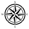
First, I finished drawing all of my "skylines". I decided that I wanted to have a total of 11 different "skylines". Each of these of course are derived from my memories over the years. and it was so special to me to be able to recreate these. Some of my favorites that I added were "Biking Bluff", "Marker Labs"', and "Creek Crossing." It's kind of hard for you to see the small details of the skylines, but in person, you can tell what the specific details that form these memories. I think I did a good job making the skylines, and they added good dimensions to the map. Similarly to Anton Thomas's map, the drawings added a more personal element that I couldn't have obtained without them. Next, I added more detail to the other aspects of my map. In order to make my map the best I possibly could, I decided to make sure that every little stone could be as detailed as possible, but of course, that is a basically impossible. Despite this hyperbole, I still wanted to make it as detailed as was reasonable for my time crunch. Specifically, I did this with the bricks and other stones. This house was home to a lot of stones. There were sidewalks, patios, borders, and walls all made of bricks and stones. Although a beautiful accent to the landscape, it was an egregious task to complete when drawing these. Not only were there a lot of them, but they came in all different shapes and sizes. For example, on one sidewalk, some bricks were vertical and other were horizontal. After all is said and done, I'm glad to say that I put in the extra effort just to make my map a little better. Also, I sketched some mountains on the hilly parts of the map. Anton Thomas used this technique for his map, and I thought that it added a perfect touch. So, I decided to use this technique as well, and I think that it did a good job displaying the physical geography of the yard without making it look too formal. Afterwards, it was time to draw my compass rose. The compass rose is an essential part of the map if you ask me. Without one, you would have no sense of direction whatsoever. You might be asking Why would that be important for a fantasy map? Well, I would say that there are two main reasons for this answer. First, in the hypothetical situation where you get lost in said fantasy world, you would need your compass rose to tell you which way to escape. Now, that isn't very practical because that only happens in the movies, but there is a more relatable reason. Compass roses make your world real. A lot of the times, maps are of real places that you can physically be located in, but that isn't always the case. For me, my map is technically of a real place, but you can't physically step into it the way that I have drawn it. The compass rose gives it an element of reality that you wouldn't have without it. The process to making this was quite long. I had to line up my map to Google Earth to make sure that it was accurately pointing north. After doing that, I had to come up with a unique design. I wanted to create a compass rose that set the tone of the map, and that is why I chose the design I did. After playing around with different colors and shapes for a while, I was finally able to choose the design I wanted- an incredible feat for someone as indecisive as me. In order to make it perfectly symmetrical, I decided to make exact measurements. Furthermore, I used a ruler to construct a mini grid to enable myself to put the points in the correct spot. After erasing it once, I got it to look how I wanted for it to. Lastly, I colored it to add some pop and allow for it to shine. In conclusion, I think that this compass rose adds a child-like element to the map, and it brings me back to my time of childhood. It sets the tone that I was going for and is a perfect fit. Then, it was time for the second-to-last step of my map-making journey, coloring. Although this may seem like a really fun task compared to the rest of my process, this was actually my least favorite part. Overall, I had a fantastic time making this map, but the coloring part definitely was the low. This just shows how you don't have to like every aspect of something to enjoy it. I have never really been one for coloring, and I'm not the best at blending colors to make it look extra fancy. However, I decided to try my hand at it this time. I started by coloring all of the skylines because then, I would be able to color around them afterwards. Later, I decided to tackle the most difficult task of coloring in the bricks. Most people would decide to color each brick the same uniform color of red. However, I am not most people, so I decided that I would color the bricks with ten different shades of red. Unfortunately, this turned out to be a bad decision, but It did make it look more realistic. Halfway through coloring the first sidewalk, I thought that I couldn't go on any longer. But, I pushed through the back pain and completed every individual brick. After that, I was finally in the home stretch. I colored all of the lawns and woods different shades of green. As a final addition, I drew some trees. Since my map was from a bird's eye view, I drew the trees as though you were looking at them from above. Lastly, I wanted to give my map a fantasy twist. So, I decided to make it an island. Moreover, I would draw clouds around the island to make it look like two things. One, I was in the clouds when I was at this house. The rest of the world was below me, and it was just me in my favorite place. Two, it would make it look like you are inside of my mind. In the cartoons, they always make it look like a person's dreams are in clouds with unicorns and rainbows, so I decided to take one aspect of this to my map, the clouds. I wanted it to seem like the reader was taking a peek into my memories and my past. Anyways, I did this by drawing upside down U's throughout the outside of the borders of the island. I did this all over to make it look more textured. I thought that the clouds in regular pencil were a little boring, so I finished it off with a touch of blue. After completing this final step, my map was finally done. Once I took a step back and glanced over my map, the months of research and hard work came full circle. All of the little techniques and details about maps that I had learned had played into the creation of the map. Without it, it might have looked like a pretty drawing, but I think that I was able to combine elements of both a map and a drawing. With each color, a new meaning arose, and I don't exactly know why. I think it enlightened me on how fast time flies by. When you are young you think that these days are never going to end, but as you grow up, you start to lose the light in your eyes and become obsessed with other things. You don't stop to cherish the moments when you are younger because you don't feel the need to, but now that I have grown and these times have passed, I realize the importance of never forgetting these times. You may not have known it at the time, but each memory has had more of an impact than you knew. Consequently, this map revealed this to me, and that is why I am so glad that I chose to draw this map specifically. Whether I like it or not, this house has shaped me as a person to this day. The fun times taught me how to express myself and love my surroundings. The tough times have taught me that you need bad things to happen in order to create a brighter future. For example, we got chickens when I was in fifth grade. One weekend, my parents were out of town, and the chicks had just moved into a bigger coop. I walked outside and found that my favorite of the bunch had been taken by a mystery animal. All that I had left was a few feathers. This was a really hard moment for me, but it taught me to cherish the things I have only if they are for a short period of time. Even if you lose it and it hurts, it still caused you to have a bright smile, and that is all that matters in the long run. This is one of the many lessons that I learned at this house, and although it isn't directly displayed on the map, the map gave me an opportunity to reflect on all of the things that happened over the ten years that I lived there.
1 Comment
Hello and welcome back to my blog! I know that I promised a map reveal this week, but I feel like I could make it a little bit better. I swear it will be ready next week. Also, I decided to wait one more week because, sadly, this is my second-to-last blog post ever, so I decided that I should close out with a banger by revealing my map. In the meantime, I thought that it would be fun to research the different map classifications for two reasons. One, I can figure out which category my map belongs in, and two, I will know the different types to sound smart in the future. After doing some research, I found that there are a lot of different classifications, including more specific classifications of classifications. So, I will only be sharing the general classifications. In other words, I will be showing classifications similar to the genus or the sixth most specific part of the seven animal classifications for the science nerds out there. Anyways, let's get started with some classifications!  1. Topographic Map A topographic map is a map that uses contour lines or other methods to show the shape of the earth. These maps show both natural land features and man-made land features. You might be wondering what contour lines are. Well, the definition of contour lines is, a line on a map representing an imaginary line on the land surface. In other words, lines to show the different elevations/ features of an area. Topographical maps are made by surveying the land to display a variety of different elevations and landforms. Topographical maps are often associated with the fields of geographical planning, civil engineering, architecture, and recreational hobbies, such as hiking. I have actually made a topographical map as a science experiment earlier this year. I found that they were a little bit difficult to make, but I'm sure with practice anybody could become a master at making this type of map. Additionally, they use common symbology to represent different things, and they also can use different line colors when representing contrast between two areas. Now, I will be showing you an example of what a topographic map looks like. In this map, you can see that the map-maker used this map to show the different elevations of a mountain, but also, they use a few other techniques to represent different things. First, they use blue to represent the water and brownish to represent the actual land. This is used to make it more understandable for the reader. Next, they use green to represent the trails, blue for rivers, and a darker blue for roads. Furthermore, some lines were dashes to show smaller, less important trails. Lastly, symbology is used to show different campgrounds. After looking at this map, you can assume that this would be primarily for somebody hiking these trails. 2. Geologic Map A geologic map is a map that shows the geological features of an area. If you didn't know, the prefix geo means earth, so from that information, you can deduce that it has to do with rocks or other features of the earth. However, these features are underneath of the earth, so there has to be a different approach to mapping these things. Cartographers use different symbology or colors to show the composition of the earth beyond the surface. Features including fault lines or foliations are shown with a strike or dip symbol, giving a three-dimensional orientation. Moreover, there are two different types of measuring orientation. First, orientation of planes is the use of dips and strikes, and this, of course, is the type used for fault lines. Second, orientation of lines is measured in trends or plunges, which are symbolized through arrows to show linear features of the land. Fun fact, in the UK, these maps are known as geological maps instead of geologic map. Also, in the US, geologic maps are laid over top of topographic maps to create a dynamic duo that can show both the features above and below the ground. Now, it is time for an example.  This map shows the different types of map in a certain area. Additionally, it shows what age of the Earth each color comes from. For example, one color represents sedimentary rocks from the tertiary age. As you can see, each color represents a different age but not a different rock type. Namely, one color features all three of the rock types. All-in-all, I think that these types of maps are cool because you can see the nature of different rock types. 3. Political Map Political maps are the maps we first learn about in school, so they are the rudimentary map style to many people. They convey a limited amount of information, and let's be honest, they aren't that interesting. Political maps show the political aspects of an area. Furthermore, this includes borders, large landmasses, bodies of water, and important cities. Thus, the map style is most commonly style for world maps. These maps don't have to be of such a large area though. They can be for countries, continents, cities, islands, and more. The main classifying features of these maps are borders, so these maps can actually be included in other maps because many times cartographers want to include the locations or borders of their map. This is because humans like to categorize things based on their relative location to other more familiar places. Hence, a person who lives in the state of California would first look to find where California was in relation to the focus of the map. Fun fact, I have memorized both the political map of every country in the world and the political map of the states of America. Once again, it's time for the example.  For this example, I decided to use a map of the world because this would be the most recognizable example of a political map. Consequently, it would be the easiest way to grasp the concept. This map doesn't need much explaining, but I will still give a short rundown of what it is saying. This is a map of the world that shows each country. Interestingly, maps of the world use different colors on each country but for different reasons than we are used to. This is mainly to differentiate the countries from each other to make it easier to read. This can also be helpful when memorizing maps because you can connect a country with a color. Incidentally, different maps use different colors, but most maps of the world use this technique. Another interesting part of this map, it the list of numbers correlating to countries on the bottom. This shows a technique to fit in extra information when you don't have enough space. Similarly to the inset map, they show information without overcrowding the map. 4. Physical Map Physical maps are another fairly common type of maps. This is primarily because they convey important information to the average person where some of these are mostly used for specific jobs. These maps are used to show the physical features of land. Accordingly, this includes elevations, oceans, and glaciers, and they also have different colors based on how elevated each feature is. For example, the areas with low elevation might have a light green color while an area with a higher elevation would have a brown color. Furthermore, the maps make the map look textured and almost 3-D. The description may seem fairly similar to the topographical, but they each have distinct differences. Topographical maps use lines where physical maps color in specific areas that have more elevation. Thus, physical maps are more commonly used for larger areas, like the world map, and topographical maps are used for smaller maps, such as a mountain. Similarly to the political map, these maps do not showcase much cultural information. If I had to put the two in a category, I would place them in general information. Unfortunately, I have no fun facts about physical maps, so I'm gonna have to get a little creative. Here is a fun fact, I have vitiligo, and one spot on my stomach looks like a map of the United States, and that is technically physical. Anyway, let's jump right to the example now.  This is an example of a physical map of the world. I specifically used this map because I wanted to display the major differences between political and physical maps. As an example, this map does not have any borders between countries while the political map doesn't use colors to show the different elevations. On the contrary, the both are used to show one point of information, and this information is easily understood. It's very interesting to see the contrast between different regions of the world. Southern Asia is home to a large amount of elevation where Greenland is largely flat. If I had to choose between this map or the political map, I would choose this one because it looks more appealing and shows more interesting information. 5. Road Maps Road maps, also called route maps, are maps used to display information about transportation. These maps are used primarily for navigation, but they are also a type of political map because they contain borders. This is an example of how political maps are the cornerstone for many other maps. Additionally, road maps show tourist attractions because tourists are the people who most commonly use them. These maps come in all shapes and sizes based on what you are trying to say. Here are some different forms of road maps. Large maps give a lot of detail and cover large areas, small maps give an overview of the main roads in an area, highway maps show the major routes, street maps show the metropolitan areas, and a collection of road maps is known as a road atlas. Road maps use small lines to represent smaller roads and thicker lines to show bigger roads. Nowadays, road maps are within your phone because Google Maps uses road maps to help people get from place to place. Without road maps in our lives, many people would be constantly driving around in circles, so you should be thankful for that.  This a road map of New York City, New York. As you can see, it displays the roads within the city. However, this map does not show every single road, and in fact, it actually shows a fairly small number. The more important roads are colored in either green, orange, or red, but the less important ones are just gray. Also, it has one of my favorites, inset maps! This inset map is used to show the location of New York City and give a larger perspective. Furthermore, the map shows all of the airports around the city, which is an indicator that this is most likely for tourists who are travelling. In conclusion, when adults use a map, this is the type of map they're most likely picking up. 6. Cadaster Map This is the first map that I have had no idea what it meant from the name. So, like any logical person would do, I did some research. It turns out that the word cadastral means, pertaining to the valuation of a landed property as a basis for taxation. This told me that it probably was something along the lines of a map that shows property value, and it was. A cadaster map shows the location, region, owner, value, and occupancy of buildings. Also, maps involve a geographic description of a building. After looking at a few, I found that they are commonly very monochromatic, and they are commonly used solely for informational purpose. These can be important for people who work with the buying and selling of property, such as a realtor. Moreover, if you have ever looked at an app that shows vacation rentals or houses for sales, this is most likely the type of map you were looking at. Cadaster maps are used in urban areas because this style wouldn't really work without buildings that were fairly close together. I think it's time to give an example because these are kind of hard to picture.  This is a map of a city in Denmark, and as you can see, it fits my description of a cadaster map. Each building is labeled with a number, which is displaying the value of the building. There are not really any labels, and it is a very simple map. Out of all of the other maps so far, I would say it looks most similar to either a road map of a political map because it can only really show one piece of information. Although it may not look the most interesting, I'm sure that a map similar to this would be crucial to some people. 7. Dot Distribution Map The name of these maps says it all. Dot distribution maps use dots to specifies the quantity of a point of information on a map. The dots use spatial presence to show how much of a feature is located in an area. There are two different types of these maps. First, one-to-one show one single instance of a feature. This would be used for more large scale things with. Second, one-to-many shows more than one feature per dot. These dots do not show the exact location, so they may not be the best for displaying information that needs exact information. However, these maps can be very interesting and appealing to look at. A very common use of this style is to show lights turned on in a specific area. Things like this would be hard to convey in a different style, so cartographers use this method. Sometimes, dot distribution maps contain borders, but other times, the dots create their own borders. This might not make much sense now, but this example will show you what exactly I mean when I say that.  This is a dot distribution map of the population density in America. This is the most visually appealing of all of the maps, and it conveys a strong message as well. It does a good job at describing the information in a clear, understandable way to the reader. It also allows you to point out larger cities, especially in less populated areas like Arizona. This map does use borders, but you can imagine what it would look like if it was taken away. It would still maintain some of its integrity, and the East Coast would at least look familiar. This is one of my favorite types of maps because of the visual effects and the clarity in the information. 8. Thematic Map Last but not least, the thematic map. This type of map is used to show a theme connected to a geographical region. Thematic maps focus on one specific element compared to some maps which show a combination of elements. These maps create patterns with the information to show the spread and distribution of the data. In some ways, they are similar to the dot distribution maps because of that, but these are more versatile. Maps pertaining to this style can be used to show information such as climate, population, health, soil, and much more. Additionally, this is the type of map you are probably thinking of when discussing a map on the informational side. Thematic maps use colors to display their patterns, and this can mean going from light to dark in the same color or just using a range of different colors. Further, these maps have three main purposes, to provide information about about a specific topic, to provide information about the spatial aspects of a topic, and to compare patterns on different maps. Now, I will be showing you one of many examples of a thematic map.  This is a thematic map that displays the poverty rates of people under 18 in America. This map is very interesting to me for multiple reasons. One, the bigger, western states have larger areas while the smaller, eastern states have small dots littering the states. Two, most of Mid-Western America is white, and South Dakota has a large, dark area. It would be interested to find out why that is so. Last, The darker sports are in patterns throughout the country. There are lines of red in certain areas showing how different areas are much worse. This is my favorite style of map because it conveys the most amount of information, and it creates patterns that leaves you asking questions.
After taking a close look at each of these eight styles of maps, I have concluded that mine does not fit perfectly with each any of the classifications, but it is more of a mixture. The main difference with mine is that it is in such a small area that there isn't much information to be displayed. It definitely has elements of political and physical though. It does have borders, but just not the borders you might think of. My map is like my own little world, and each area is like a little country. You can see very clear borders between my different memories and that is why I think it is political. It is physical because I show different physical aspects of my home. I show the creek, the hilly areas, and the trees within my yard. To conclude, my map is a political-physical map, but it is also so much more. It isn't exactly traditional which is why it doesn't exactly fit within a category. Stay tuned until next week for the final reveal of my map!  One of many pictures featuring the quote One of many pictures featuring the quote Welcome back to another week of my blog! I know that I promised a reveal of my final product this week, but I was fairly busy this week and couldn't find the time to make it the best that I could. It's looking pretty good so far, and it's taking me on a walk down memory lane. Once I add a bit more detail, it will be ready to be revealed to the world. Next week it should be ready, but until then, I will be sharing my highs and lows of my blog so far.
After making this blog, I have found that there are many highs and a few lows of the process. I have found some things that I enjoyed and some that I didn't. I wasn't the best at some aspects and good at others. I have learned a lot over the course of a few months, and I want to show this through this blog post. I'm going to take away a lot of things from my blog, and this won't only be the perfect parts. Since my blog will come to an end soon, I thought that this would be perfect timing to write this post. I definitely have more highs than lows, but today, I will be sharing an equal amount of both. High #1: Learning New Things Out of all of the highs, this will have to be my number one. I came into this blog not really knowing anything about maps except what every country on the map is. Although you could say that is a big feat, it wouldn't exactly qualify as an advanced knowledge of the topic. Moreover, I remember searching for my topic when I had no idea what I wanted to do. Then, one of my friends suggested that I do maps, and it has stuck ever since. The first week of real research, I listened to a podcast, and when I listened to that podcast, I learned that this was going to be a lot more interesting than I had anticipated. Through this process, I have learned loads of things, including but not limited to different types of maps, famous and historical maps, how to make a map, mapping technology, and much more. Furthermore, I'm so glad that I found something that I am genuinely interested in because I actually have a drive to learn more about that subject. Additionally, I have learned new ways to learn things. When you think about research, you immediately think to look at an article, but I have learned that there are so many other beneficial methods of researching that you can use, such as podcasts, videos, or books. Learning so much new and interesting information about maps have made this project ten times better. Low #1: Coming up with Ideas I have found that it can be quite difficult to come up with ideas. Consequently, I have experienced this slump multiple times. This problem first arose when I was deciding what my topic would be. Most people didn't have a difficult time, but I decided early on that I wanted something that I both didn't know much about and was interesting. This proved to be a challenge for me, and once I came up with my current idea, the struggle didn't end. Accordingly, I experienced this problem at least every two weeks. Now, I'm not saying my ideas were necessarily bad, but they were just sometimes difficult to come by. Luckily, over the course of the semester, I have learned some tricks to creating ideas. First, I try to think of something original that I haven't thought of before. Second, I think about what would be most interesting to me and the reader. Third, I think about what I have done in the past and try to build off of that. Last, I look at other blogs to discover some new concepts that they used. Hence, I found that doing these things have made it easier to constantly come up with new ideas. Also, I have discovered a new-found respect for people who make videos or articles multiple times a week. I don't know how somebody can constantly be that creative. High #2: My Journey/ Growth All of the time, we hear the quote, "It's not about the destination, it's about the journey" but I have never truly understood it until now. Warning, this might sound a bit cheesy, but I have grown and experienced so much through this blog. As a result, I am going to take away so much from this path that I have taken. Sure, my goal was to make a map, but I was mainly focusing on learning about maps. Nevertheless, the end-product is important, but what I learned is so much more important. Here are some things that I will take away from my blog. One: it's okay to have different ideas than everybody else. When everyone was announcing there ideas, I found that most people's topics were fairly similar. This worried me because I was afraid that my idea was a little too out there, but I quickly learned that they were the ones at fault because I have thoroughly enjoyed myself. Low #2: Time Management I fully admit and accept responsibility for my lack of time management skills. Although you might not be able to tell from my blogs, I tend to write my blogs on the last two days before they are do. However, I'm not the kind of person who likes to go 50% on anything I do, so I eat up much of my work days writing and perfecting my blog. Each week, it has been one of my goals to get a little bit better with time management, and I will say that it is going pretty well. Unfortunately, no vast changes have been made, but I am making sure to do my research throughout the week. For me, I like to do all of my writing at the same time because I get into a flow, so I do the research prior to writing. I have found that this works well for me, but I'm sure that every person has a different style. Regardless of my lack of time management skills, I think I am doing pretty well with my blog so far. High #3: WRITING! As many of you may know, I love to write, so anytime I can put pen to paper, (or fingers to keys) is going to be a good time for me. This year, I have been focusing on growing as a writer, so I thought that this would be a perfect opportunity to do just that. I have put a lot into each of my blog posts. Thus, I have gotten so much out of each of them as well. I have worked on writing in different styles than I am used and stepping out of my writing comfort zone. I am the type of person who likes to write a lot, and when I say a lot, I mean more than I really need to. Personally, it's not really a thing I can control. I start, and I can't stop until I've written as much as I can. I have used this to my advantage by writing about a lot of different things each week, as I am doing today. I like this form of writing because I am allowed to explore and express myself. When I used to do things like weekly writings or boring reports, I didn't show my full potential. Further, I wasn't passionate about my writings either because I wasn't interested in the topic. I have found that it is one hundred time easier to write when you actually want to write about that thing, and I will admit, I do actually want to write about maps. I have gotten so much more out of this blog than just information, I have gotten writing experience that I can use in the future. Low#3: Not Enough Time I have found that only having half of a school year to do this project is just not enough for me. Some people might think that would be plenty if not too much, but for me to learn as much as possible, I would have loved to have a whole year. With this time, I could've learned twice as much, write twice as much, create twice as many maps, and more. Comparatively, you can't expect a tree to grow to its complete beauty in half a year. I can't grow fully in half a year. Considering this, I decided to put in twice as much effort to make up for this lost time because I do want to be able to grow as much as I can in this time period. I never really get tired of this because I enjoy it, so I could do it every year if I really had to. I know this isn't exactly realistic because I would eventually run out of things to write about, but I'm going to keep on exploring until I do. Currently, if I had to relate to a quote, it would have to be, "Why do you write like you're running out of time?" from Hamilton. All-in-all, I have experienced many highs and lows through this journey, but these things are inevitable. I have learned how to manage the lows and how to embrace the highs, and that is something that I will definitely be taking with me after my blog is over. Moreover, I will continue to use these things in my future writings and research. It has been so interesting to learn about maps, and I will forever have a superior cartographic knowledge that I can count on. |
Archives
September 2021
Categories
|
 RSS Feed
