|
Hello, and welcome back to another blog post! This week I finally started my map. Originally, I had planned to follow the class on SkillShare, but in the end, I decided to kind of go off on my own. I did this because I wanted to do my map a certain way, and I thought it would be more beneficial to do it on my own. I will still be taking a few tips and tricks from the class, but I won't be watching each video. However, I will still be using the same idea because I actually really like the idea. Anyway, I will be telling you about my process and why I decided to use this particular process. So let's get started. So, my main inspiration for my map was the map of North America drawn by Anton Thomas. If you don't remember, this is a map that uses a lot of color, and with each important city, Thomas draws a skyline showing the importance of each one. Also, it features animals found in the area and what the environment looks like. I will be using the idea of drawing sort of a "skyline" for each important place I will be highlighting. My map does not feature particular cities, but it includes areas of importance, which I will be using in the place of a city. Now, I will be sharing the steps I took in making my map. I am not done with the map yet, so next week, I will be showing the finished product along with the rest of the process. 1. Grid I decided that if I wanted to make my map as accurate as possible, I should use Google Earth to my advantage. I used this by taking a screenshot of my old house on my computer. Then, I put the image in Google Drawing and put a grid on it. Furthermore, the paper I am using is 9 inches x 12 inches, so the grid was 9x12. I used the grid to make the drawing of the landscapes and specific things easier. Next, I drew a 9x12 grid on my paper. After this, I was ready for my next step.  2. Driveway, Sidewalks, and Water For my next step, I drew all of the basic borders of my map. This includes the driveway, sidewalks, and water. This is the main part where I am using the grid in order to get perfect precision. Initially, I drew the driveway. I started with this because it is the biggest and I would be able to draw my other items in relation to it. My driveway was kind of long and weird, so this part took quite some time. But, after my hard work, I had a beautiful driveway. I used the grid by drawing each segment of the driveway on each grid onto the correlating grid on the paper. Afterward, I drew the sidewalk that runs in front of the house. I used the same process to add this to my map. Lastly, I drew the creek that runs through the front of the house. This did not show up on the image because it is covered by the lush forest, so I had to guesstimate using my memory alone. It isn't perfect, but I think it is pretty accurate. Overall, I think I did a good job creating this aspect of my map.  3. "Skylines" Next, I began to draw the "skylines". I am not finished with these because I wasn't sure how many or which ones I wanted to do, so the rest of them will be featured with the final product. However, I still got some good work done on these. The drawings were purely from my memory, so they probably aren't perfect. But, I think I did a pretty good job considering that. For these "skylines" I chose some of my favorite reoccurring things to do from when I was younger. Next, I drew how they looked to me. This involved drawing them so that they were parallel to the bottom and top of the paper, unlike the rest of the map which is slightly slanted. I did this because I thought that it looked more appealing that way. After drawing them, I wrote the name of the place according to young me. Thus, the names are a little wacky sometimes. For example, "chalk city" and "Australia" are among the names of the places. I also couldn't think of the name I wanted to use for some of them, so I added a fill-in name instead. As of right now, I have drawn 6 locations, but as I said earlier, I hope to add on later. 4. Detail As my last step for this week, I added more detail to the map. Basically, this was just filling in most of the holes of the map to make it seem more real. Moreover, I added things such as lawns, stone borders, patios, trails, and more. There is still tons of detail that needs to be added, but it still looks way better with the amount I have added so far. I hope to add detail until it seems like I am looking at a picture of my childhood. This might be a little bit difficult considering I have no way of actually going to see it, but that's the fun in it! I know my map will not be as accurate for that reason because most map makers spend a long time surveying the land they are mapping, but currently, I think this is going to be fine.  That is all that I did this week, and there is still so much to be done. When you see the final product, there will be much more detail added. Next week, I am planning to add more skylines, add detail, make it more clean and precise and color, so stay tuned for that. I hope you enjoyed this week's blog, and I can't wait to show you the final product!
0 Comments
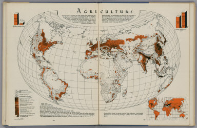
Hello, and welcome back to my blog! This week I will be sharing my 18 favorite maps from the book, All Over the Map: A Cartographic Odyssey, by Betsy Mason and Greg Miller. When I say favorite maps, that could mean an array of different things. For example, I could like a map because of its interesting history or its unique style. Why did I choose to do the random number of 12? Well, I wanted to make sure every type of map was included. This book has nine different categories of maps each with unique traits. Thus, each category is represented at least once. These maps are not in order from best to worst because that would be too hard to decide, but they are in a simple, chronological order. Without further ado, let's get started! #1: "A Pirate's Pilfered Atlas"(p.18)  You might remember this map from my previous post where I used it as one of my inspiration maps for the map I am creating. Furthermore, I promised a backstory, so here it is. This map originated from a Spanish atlas originally on the Spanish ship, Rosario. This was in 1680 when pirates sailed the seas in search of riches. A crew of English pirates sailing on the Trinity stumbled upon the Rosario of the coast of Ecuador. They were led by captain Bartholomew Sharpe. They raided the ship and gained possession of a very important item, the atlas. This atlas would be very beneficial to the English because they wanted to contest Spain in South America. Sharpe brought this treasure back to King Charles ll. The king knew this was very important and ordered William Hack to create an English Version. Hack's version contained childish drawing filled with beautiful, detailed notes that would benefit many sailors. This map caught my eye because of its colorful composition. It aesthetically pleasing, but at the same time, you can tell it is filled with detail. The story behind it is also incredibly interesting to me. It shows how you can have an informational map that is also a piece of art. I'm not sure that this would be able to help me if I was lost at sea, but I'm sure it helped many trained professionals at the time. #2: "The Shape of Water" (p.36)  This is a map created by Jared Price of the waterways in America. When looking at it, it seems as though there are mountains and other landforms drawn on the map, but it is actually just water. This map shows how water changes with topography. If you didn't know, topography is the arrangement of the natural and artificial physical features of an area. For example, mountainous areas have shorter streams of water while plains have long, wider rivers. This map was really interesting to me for a couple of reasons. First, I never knew how much the physical features of an area affect the waterways in that same area. It was fascinating how different each area was. Second, this map shows the amount of water within the landforms. We grew up knowing that 70% of our surface was oceans, but I never knew how much of our countries were water as well. This map really displayed that to me in a clear, understandable way. #3: "Planning the Capital" (p.50)  This map depicts Pierre Charles L'Enfant's plan for the capital city, Washington D.C. L'Enfant was a French artist who migrated from France during the Revolutionary War in hope of military glory. However, he wanted more than just glory, he was an artist who was skilled at both engineering and architecture, and he decided to leave his mark that way. Alexander Hamilton helped to kick-start his career by landing him a job to renovate the city hall building in New York City. His renovations were so beautiful and elegant that he was able to convince George Washington to let him design the nation's capital. He was given a deadline of three weeks to complete his plan, and he used every minute to create his prestigious plan. He created a magnificent plan that would highlight the important places in the capital and show the true glory of America. Unfortunately, L'Enfant got into a disagreement with Thomas Jefferson on how to approach the plan. This resulted in L'Enfant being removed from the project altogether. They stuck to Jefferson's plan and it proved to not work as well as they had hoped. In 1900, a group of architects decided to revisit L'Enfant's plan. His vision was finally created and turned into the beautiful city we know today. This map isn't the most stunning map I have ever seen, but the story behind it is incredible. Not only does it give you a glimpse into the building of the country we know today, but it shows how eventually your hard work will pay off. L'Enfant may have died a poor, unrecognized man, but eventually, his true greatness was shown. #4: "The Colors of Destruction"  After World War ll, much of London was left in destruction due to the countless bombs dropped by the Germans. The London County Council ordered the areas' architects to map the level of destruction each building suffered. This went on a scale from yellow, meaning blast damage, to black, meaning total destruction. The map shown here is a map drawn of the Limehouse and Stepney Neighborhood in London. As you can see, there is a large range of destruction throughout the neighborhoods. These maps represent the effects of the war that were felt throughout the city of London. It affected so many people in different ways, and this map does a perfect job of representing that. Not only do the colors pop out of the page to create a lasting image, but they convey a point to the reader. #5: World War ll in 3-D  During World War ll, the allies created 3-D maps that quite possibly led them to victory. These maps were created for soldiers going into unfamiliar terrain, so they knew what to do. Each of the maps created had exact detail, and if one little thing was messed up, everything could have been ruined. This only happened one time when they miscalculated the height of a wall and led to the loss of that battle. The most important time this strategy was used was during the planning of the attack of Normandy, France, better known as V-Day. This map was used to create a flawless strategy to complete the assault. Furthermore, this map showed the soldiers what to expect in a clear, understandable way. Without it, there may have been a different outcome. This set of maps was compelling to me because they were such a crucial part of the war. Additionally, this is a prime example of a productive way to use maps. Furthermore, they were designed in a way that anybody would be able to understand them. #6: "The Heart of the Grand Canyon" (p.118)  In 1970, Bradford Washburn created a map that is still known today as the best map of the Grand Canyon ever created. This map took years of planning, surveying, drawing, and more, and the hard work definitely paid off. Washburn was inspired to create this map when he went to the Grand Canyon with his wife and found there was no excellent map of the area anywhere. With a total of $40,000, he set out to create his map. In order to survey all of the land, he had to send helicopters to the places where the average human couldn't go. After seven years of field-work, it was finally time to create the masterpiece. The project had ended up totaling $100,000, which is equal to half-a-million dollars today. The drawing was no easy task either, but he had people from all over the world help with his map to make it look as good as it does today. Finally, after 1075 hours of painting, he was finished with his map of the heart of the Grand Canyon. This map shows how much work goes into creating a map that is more than just good or great even. Washburn poured his heart and soul into this map, and that really shows through the exquisite detail of the map. #7 "The Virtues of Farming" (p.148)  The map above is one of the many maps in the Atlas of American Agriculture by Oliver Edwin Baker. This atlas was created to advocate for farming across America. Baker believed in "rural" farming. This means people who live in urban areas plant some of their own food creating a balance of self-sufficiency and reliance on others. Baker created each map to inform the population on the conditions in your area. The map above shows the types of soil throughout America, so you can use plants that fare well in that soil. This was published during the time of the Great Depression when farmers were struggling. Not only was it hard to get deposits from the banks, but the dust bowl had just swept the nation. The atlas helped get struggling farmers back off their feet by showing which plants to plant in order to get the most out of crops. These maps were the best example of informational maps that I have found. Some of the other maps were really good, but these are purely informational. They do end up looking appealing, but that was not their purpose. If you are ever looking for some inspiration on that front, turn to the Atlas of American Agriculture, and you won't be disappointed. #8: "The Art of Mapping the Brain"(p.200)  Santiago Ramón y Cajal was a pioneer of neuroscience. His discoveries set the foundation of what we know today. His maps of neurons helped him make these discoveries. This is the first example of a map of something other than land or water, and this is a perfect example of one. Cajal began studying the anatomy of cells and tissues by using a microscope. Italian scientist, Camillo Golgi, aided him in his discoveries by inventing a new way to stain tissues. This allowed Cajal to see single neurons. He began to draw what he saw through his microscope, and luckily, he was a brilliant artist. By studying his drawing, he concluded that neurons are individual cells that interact with each other. Prior to this discovery, scientists believed that neurons were a system of cells. Cajal made many other discoveries during his careers, and along with his discoveries, he made some amazing maps. These maps allowed him to explore the things he did, and they allowed him to win a Nobel Prize for Physiology or Medicine. Without maps, we might not have been as advanced in the field of neuroscience as we are today. #9: "The Urban Smellscape" (p.238)  Kate Mclean focuses on a different aspect of the city when making her map. She wanted to show the "smellscape" of a city because there was enough landscape, and she wanted to do something different. She noticed how in different areas and times, there were different smells. Mclean decided to explore that by enlisting a group of seven people to walk around Kiev, Ukraine on Christmas morning and record the smells. By making this map, Mclean wanted to show how each person has a distinct sense of smell. Furthermore, she wanted to prove that a map didn't only have to be of the same aspect of a city every time. Mclean plans to map more and more cities and compile the maps into one picture in order to discover the secret of the smellscape. This map caught my attention because of its unique look. I was perplexed because I didn't know what it could be. The fact it was in a different language didn't help me much either, but after learning about the origin of it, I am truly fascinated with it. It shows so much different things at one time while still not being too overwhelming. Mclean has created a perfect example of an innovative map. #10: "Flattening the World" (p.264) For ages, cartographers have struggled with the task of finding a way not to distort the world on a piece of paper. The problem is, it's basically impossible. When trying to minimize one form of distortion on a map, you increase the rest of it. The Earth is a 3-Dimensional, spherical shape, so it's hard to fit it on a 2-Dimensional plane. In the past, cartographers have created different projections. A projection is a way of representing curves on a flat surface. Each projection reduces one type of distortion and increases the other. There are 5 types of distortion: area, shape, distance, angle, and direction. The first projection was created by cartographer Gerard Mercator. Mercator's projection focuses on angles and distance. This is because, in his time, people used maps to travel, so they needed an accurate map in that category. Peter's projection is another style of projection that minimizes area. He created this style to be able to show a developing world. Therefore, it was popular with development organizations and educators of his time. Peter's projection is not liked by many because it distorts the shapes of the land way too much. the Winkel Tripel projection style is a popular style of projection because it minimizes each factor equally making for a less distorted map overall. People began to get more creative with their styles of projection, and you will see that with the next three. Erwin Raisz created the Armadillo projection. This style makes it seem spherical instead of flat. The shapes are actually distorted, but we perceive them as though they are not. Next, Bernard Cahill created a butterfly projection style. This style breaks up the ocean, but it doesn't cause the continents to be distorted. Last, Buckminster Fuller created perhaps the most innovative style of projection yet. His style incorporated a 20-sided shape that could be folded into numerous different shapes. This allows you to project it in different ways. All of these maps show the creation of a solution to a problem. Although I think this problem can't be perfectly fixed, these maps each have their own remedy to the solution. Together, they each show a different perspective of the world that we might not have thought of ourselves. #11: "Jerry's Map" (p.283)  Jerry Gretzinger has spent 55 years of his life creating his fantasy map. His map is filled with both abstract and concrete elements from cities to cereal boxes. The entire map is composed of 3,500 panels that are 55 feet across. Each panel has a different image, and together they make one, huge map. The map all started when Jerry became bored during a day of work in 1963. He was working at a Michigan ball bearing factory as a summer job where he monitored machines. He began to doodle on a piece of paper. These doodles included roads, buildings, and much more. After he finished his first page, he went on to another page, then another, then another, and so on. As Jerry grew, so did his map. He took his map with him as he moved from place to place constantly adding on to his map. Jerry stored the map away in his attic for twenty years after his wife gave birth to their son. He didn't think about it for 20 years until his son found the map in the attic where it had been for a long time. When Jerry saw it, he immediately began working on it. At this point, the map was so big that he didn't know where to add on. He created a game out of it by using playing cards to tell him what to do and where to do it. Jerry's friends convinced him to begin showing his map in public, and that is what he did. He has brought it to many different places, but only once has he shown the full map. That one time was at the Massachusetts Museum of Contemporary Art when is map was only 2,600 panels. Jerry continues to add onto his map creating more fun twists to his game. This map shows how you can enjoy making a map. Jerry didn't make his map to show off or to get money, he simply made it because he wanted to. This map is truly a masterpiece that should be remembered for a long time. #12: "An Epic Mapmaking Journey" (p.302)  Last but certainly not least, we have Anton Thomas's map of North America. This map was used in my most recent post as inspiration if you remember, and I absolutely love it. Thomas is originally from New Zealand, and when he traveled to the United States in 2011, he fell in love with it. He noticed he had a knack for art when he drew a picture for his friend's refrigerator, and the rest was history. Thomas spent four years creating his spectacular hand-drawn map of North America. He filled every open space with animals, trees, rivers, cities, and more. He chose 600 important cities and drew a skyline of each of them. The skylines include important landmarks or iconic parts of that city. He drew each thing a specific way in order to capture the character of what he was representing. For example, when drawing Havana, Cuba, he could have just put some simple music notes, but instead, he chose to draw the rhythmic pattern of the rumba, a style of music that originates from Cuba.
This is by far one of my favorite maps. It has a high level of complexity, yet it looks simple. Thomas does a fantastic job of highlighting the important parts of a place with such detailed images. Moreover, It makes the reader feel as though they have been to each and every place. Thomas has basically created a fantasy world with a real location on Earth. Hello and welcome back to another week of my blog! This week I will be taking six more lessons from my class on SkillShare. Furthermore, this will involve learning a bit more about the history of maps, planning my map, and beginning the process of making my map. This blog will be filled with information and fun so buckle up! Day 1: "The Map Inside" In this lesson, I learned a new word used with maps, simulacrum. This is a very weird and fascinating word, and the definition definitely suits that. Simulacrum, a term popularized by French philosopher Jean Baudrillard, is a visual creation designed to trick the eye by presenting a likeness of something real. In more simpler terms, it is a fantasy version or representation of something that is real. For example, Disneyland is a form of simulacrum. It took meticulous planning to make it seem as magical as it is to so many. The different places are placed in locations that make it seem like you are actually there. Similarly to fantasy maps, simulacrum allows our minds to escape the bustle and stress of life and take a journey inward to a magical place. One map that I learned about in this lesson that displays simulacrum at its finest is a map of "fairyland" created by Bernard Sleigh. This beautiful map places all of the famous fables, myths, and nursery rhymes into one tangible piece of art. Thus, if you look at the map, you can see all of your favorite childhood stories, and you feel like you are actually a part of that world. After scanning over the map, it is inevitable that you will see at least one recognizable story interlaced with the other images. So far, I have only talked about what the map shows, but there are also some tricks Sleigh used to make this map so memorable. If you look in the center of the map, you will find a myth of the Norse Gods, Asgard surrounded by the Sea of Dreams. This draws parallel to one of the maps from an earlier blog post, Psalter Map. The Norse Gods look down upon their kingdom in the same way that Jesus did in Psalter Map. A lot of times, fantasy maps and religion share ties and easily relate to each other. This whimsical map shows secrets of our beliefs and opens the doors to our imagination.  "Fairyland" displays countless different myths and nursery rhymes to the reader Day 2: "Journey and Destination" Today, I learned about how adventure is an important part of a map, and I explored three different settings portrayed through maps. Furthermore, these three settings are: treasure island, hell, and Thames River. I will explain how each map brings the reader on a journey through a world of its own. The map of treasure island correlates with the book, Treasure Island, by Robert Louis Stevenson. This book was set in the 1750's and brings the reader on the hunt for treasure. The map is supposed to feel like an artifact from the time that was used by explorer, William Bones. This map allows the reader to have a first-person perspective and feel like they are on the journey with the characters. This map speaks to the little kid in all of us, hungry for adventure. I learned about a couple different maps of hell that relate to the poem, "Dante's Inferno" by Dante Alighieri. This poem takes the reader on a journey through the nine circles of hell. It is filled with detail and calls the imagination similar to J.R.R Tolkien. The map is uniquely designed and shows the story through nine concentric circles. The circumference of each circle shows the level of wickedness. Another map created by Sandro Botticelli in response to the poem shows a more realistic version of the world. It turns the symbolism into a distorted world filled with evil. Lastly, the map of the Thames River in London drawn by Stephen Walters creates a world that is both a fantasy world and a reality. This map has a distinctive voice that projects insight and knowledge. Moreover, Walters passes through different areas of London whilst telling the story of humanity. Also, it shows elements of infrastructure in London and how the city has changed over time. Basically, it shows how real places have pieces of fantasy as well. All-in-all. this map takes the reader on a unique journey through the developing city of London. Day 3:"Metaphors and Monsters" This lesson was about how cartographers use metaphors to bring their maps to life. Maps can act as metaphors rather than just the connection of data. For example, the map in Harry Potter, Marauder's Map, is used by Harry to see what each character is doing. Additionally, it has a deeper theme. It shows the true intent of the characters and shows their mischievous side. Many fantasy maps don't focus on geography, but they focus on the story. A map from The Princess Bride isn't supposed to be used as a map but as an idea of the character's journey and the layers of the book. Another example of this is Persuasive Cartography. This form of cartography is commonly used during war times. It has a villainous appeal and brings out a sense of evil. In these maps, artists use animals to show conflicts and as metaphors. For example, Fred Rose drew a map of Russia with an octopus extending its tentacles over the land. This map was showing the beginning of a war between Russia and Turkey, and the octopus represents the nature of evil and its power. After this, an octopus became a common symbol in maps. It represented the influence of a major oil company on the US government, the power of rich landowners in Europe, and the tentacles of Prussia reaching towards Europe. Metaphors are used all over the place in maps, and they are a powerful tool of the imagination. Day 4: "Searching for a Utopia" This lesson was about utopia. By definition, utopia means no place or a place of our imagination. The idea of utopia became popularized in 1516 when author Thomas More wrote a book called Utopia. In this book, a traveler meets an ambassador for the king. They have dinner, and while eating, the traveler tells the ambassador of an island he traveled to. This island was "perfect". There were 50 city-states, and each of them shared a language, customs, and laws. Every person there was working for the common good, and together, they created paradise on earth. The traveler told the ambassador to tell the king of this place because he believed that Europe could be the same. Unfortunately, More knew that this was impossible. He wrote this book to sting the reader at the end. He knew that a utopia was impossible, and he wanted to make sure everyone knew that. However, utopias exist in our minds. Our collective imagination creates a utopia that sits on the border of reality and imagination. I will be creating a utopia of my own in this project, and I can't wait. Day 5:"Planning a Utopia" Today, I finally started the planning process of my map.This map should represent what my perfect utopia looks like. To start, we planned out four different things to find what our utopia would be. It should be a geographical region that holds memories. Furthermore, it should represent familiar things and not be your "dream vacation". Most likely, this place would be from your childhood, and for me, it is. I chose to create a map of my old house, second house to be exact. I lived there from about age two to twelve, and it will forever be my home. Next, we planned what the landscape will look like. I made a list of all the memorable areas that I loved as a kid. This includes the long, winding driveway that led up to the vast blacktop, the "thick forest" that was wedged between two areas of the driveway (AKA "Australia"), The small, dirty creek, the woods surrounding the house, The humongous bush inside of "Australia", The other two neighboring, humongous bushes , the long, brick sidewalk, and the large, green yard. That was a very long list of all the important parts of my old property After, we planned specific landmarks we wanted to include in our map. These are places that hold specific memories in your heart and are important to you. These are the not-a-tree tree house, the shed covered in ivy, the "snow bush", the raised bed gardens, the grand wall, the mountain biking trail, the two trees with the slack-line and the swing, the old barbie car, and the brick wall covered in chalk. These are all of my favorite places that I couldn't have lived without. Lastly, we planned the happy things we wanted to incorporate into the map. This includes events, things, and interactions. A few things came to mind when thinking about his which are, the rain on a summer's day, creating chalk towns on the driveway, the blooming flowers of spring, the creating of new foods and drinks with the herb garden, the tennis balls littered in the trees, and Peytons' fireworks . That is all of the planning that was involved in this process. When coming up with these ideas, I was having many flashbacks and memories that I can't wait to recreate. Some design goals that we were given for this map were to create an immersive map, to create questions, to represent your personal style, to show some things and hide others, and to create an artifact of some sort. I can't wait to use all of this new knowledge and create a map of my own. Day 6: "Gathering References" So, today, I began to gather references for my map. In other words, I found a couple different maps to draw inspiration from. Each map I chose is actually from the book I am reading, All Over the Map: A Cartographic Odyssey, which I will be posting about next week. These are maps that I liked a certain aspect of that I want to use in some way on my map. Also, this week, I decided not to do a seventh day because I wanted to have all of the drawing ones together, so that will have to wait for part 3. Anyways, I chose eight different references which I will now be showing you. 1. William Hack's map of South America  This is a map of South America drawn to show a sailing route, and it has a very fascinating history. However, if you want to hear the whole story, you'll need to tune in next week. Anyways, I really like the overall style of this map. I like how Hack used different colors on different countries but left the centers white. I also like the compass rose because it isn't just the normal boring style, and it adds a pop to the map. Additionally, I liked the wording style Hack uses in the map. Although it is hard to see in this picture, he actually writes words along the coastlines in a very small font. This isn't the overall style I'm going to be using, but I will definitely be incorporating bits and pieces into my utopia. 2. Matrakçı Nasuh's map of Istanbul  This map drawn by Nasuh depicts Istanbul during the time of the Ottoman Empire. I am going to use a couple different elements from this map. First, the way the houses and landmarks are drawn are similar to how I might draw my own. It's detailed, but at the same time, it is fairly vague. If you look closely, you will see that each half has a different orientation. Originally, seeing it like that creates an uneasy feeling for me. I began to grow more fond of it, and if I find the right opportunity, I might incorporate that. I also enjoy the overall style of the map and will definitely be using this as a guideline. 3. Anna Beek's map of the Battle of Toulon  This map caught my eye for one main reason, the inset maps. The bigger map is a landscape view, and that shows a lot of detail. But, the inset map shows the area from a bird's eye view. This is a perfect way to mix a more illustrative map with a touch more regular map feel. It almost gives a blueprint of the area, and I think that will come in handy for my map. It is a way to show more detail without overcrowding the main map. 4. Max Gill's map about the tea industry  I think this map is perfect to use for the main idea of mine. I really like the overall style, and I will be using a lot from this. Gill uses little illustrations to show certain places and uses a lot of symbology. Gill also uses tons of boxes to give facts about each area. This will work with my map because I can describe the significance of each place with both words and pictures. This map has a fantasy feel to it even though it is real, in a sense. This is a good example of the use of simulacrum, something I hope to use in my map. 5. Mauriel Parry's map  This map immediately caught my eye. It was definitely not the ideas shown in this piece of persuasive cartography, but it was the art of it. Parry makes the building appear to be 3D and really makes it come to life. This is a fantasy map at its best. You can see the shape of the human skull as the land, the sea monsters lurking in the surrounding waters, and the puffs of clouds filled with mysteries. My map is not going to include this much detail, but I want it to look somewhat similar to this. You can't see it in the picture, but the border is filled with words describing the map, which I think is a very interesting idea. I will be sure to use some of the elements of this map in my future map. 6. Anton Thomas' map of North America  This map in its entirety is actually of every part of North America, but I wanted you to be able to see a little bit more detail. I really enjoy the looks of this map, and it is really pleasing to look at. I think it has a very intimate, child-like feel to it. It gives the sense of a home, and the drawings add a perfect amount of detail. Of course, my map would not be quite as detailed. Thomas uses a great font to enhance the map, and he uses illustrations to highlight important parts of the map. These drawings not only show important locations, but they also deliver pieces of the culture of that area. I think this idea could be fun to play with, and I will surely be using the style of this map in my own.
After doing all of this preparation, I feel ready to start a fantasy map of my own. Over these two weeks, I have learned a lot about the art of creating maps, and I can't wait to test that knowledge. I know that it's not going to look perfect after just one try, but I think I can make it look pretty okay. After observing all of these maps and pulling ideas from them, it can't turn out that bad. Tune into Taking Action Pt. 3 in a couple of weeks to see my rigorous planning be used in my map. See you next time with another blog post! Hi and welcome back to another blog post! Although I am making my map by hand, most maps are made digitally nowadays. Modern technology has evolved, changing how we both design and interpret maps. Subsequently, people use the maps on their phone when going basically anywhere, and GPS is becoming a necessity for everyday life. In the past, you either had to figure it out or pull out the paper map. As a result, it wasn't quite as simple to get from one place to another. In this post, I will compare the process of map-making in the past versus the process of making a map in modern days. Past Before I look at the current technology of cartography, I need to look at the technology used in the past to get some perspective. Similar to most technology, the technology that is used for map-making has evolved vastly. If you take a minute to look at an ancient map, you will find yourself asking the question How did they make that? After some research, I have found a good overview on how these maps were actually made. The methods of cartography have remained virtually the same until recently. As a person who grew up surrounded by technology, I have only known a world filled with the simplicity of Google Maps. However, people in the past didn't have access to this kind of technology, so they relied on other things. Using the measures of angles and distances and various points, people successfully made kind-of-accurate maps. Furthermore, cartographers would use the path of the sun to determine the cardinal directions. For example, using the points of the summer and winter solstice, you can determine the east-west axis. Unfortunately, these methods were far from accurate. The sun moves throughout the year, so a cartographer would have to know the exact time of year and angle measurements in order to make a map that was accurate. On the contrary, some methods were actually very accurate. One of these methods it using the celestial equator to measure east to west. Since the equator remains constant around the globe, these measure are mostly accurate. By using stars and constellations close to the equator, one can achieve this accuracy. To map the actual land, map-makers would simply count their steps from one point to the other. This was used when mapping the borders or bodies of water, like rivers. Next, you would draw a grid and draw the line using segments created by the grid. Additionally, to map the land regions, people would just climb a mountain and look around. Although that seems like it would be inaccurate, it was actually pretty accurate. People used to mainly travel on either foot or horseback, so there was no need for maps of the land for everyday use. Instead, they would just use the trails that were already present to get from point A to B. The only time where maps were crucial was during sea travels where there were no trails of landmarks to give you a sense of direction. To give you a sense of how long ago maps began to become accurate, I will give you a few different advancements in cartography. In 1762, the longitude relative to the Prime Meridian was accurately measured using the Chronometer H4. Furthermore, this was designed by John Harrison and was the first time this was accurately measured in history. Meanwhile, the current world map wasn't fully completed until 1932 when the polar regions were added to the map. Until then, there were gaps missing from the map of our world. Present Ever since the first artificial satellite was launched into space, map-making has become a whole lot easier. The meticulous process of making a map was made a bit easier by these amazing innovations. A few different technological advancements have influenced cartography, but the most impactful was the creation of aerial photography. Moreover, aerial photography was developed because of the aircraft. The use of aerial photography with cartography increased during World War l and World War ll. As a result of aerial photography, NASA was given a strong foundation for their future satellites. Some tools were use not for the actual creation of the map but for the collection of data. With machines that can track virtually anything, cartographers can easily acquire necessary information for their maps. For example, people who track earthquakes can use data from seismographs when collecting data for their maps. Three advancements that have revolutionized the world of cartography are GIS, GPS, and satellites, which all add a different element to modern map-making. Consequently, these allow making a map to be an easier process. First, geographic information system, GIS, is a program used to research layers of geospatial data. In simpler terms, GIS allows different information to be displayed geographically through maps in order to show patterns and relationships between data. Second, global positioning system, GPS, supplies coordinate through the use of satellites and receiving units. This has become an important tool for surveying, a big part of map-making. Thus, it takes a lot less time to survey and collect information than in the past. Additionally, it has become a primary tool for navigation used by people daily. In summary, without GPS, people would drive around in circles with no sense of direction. Lastly, satellites have formed a fast, reliable system to collect data for maps. In the past, it took years to collect data for your maps, but now it can be done in a mere hour. Furthermore, satellites are constantly mapping Earth's surface and supplying new information. Hence, satellites have allowed for the creation of numerous maps displaying an array of information. Learning about this topic this week was very beneficial to me. After learning about this new technology, I was able to grasp how much cartography has really changed. Being able to pull out a map on our phone is something that we take for granted, and it is a tool that past people have not had access to. Nonetheless, those people were still able to find fairly accurate ways to create their maps using the technology they had at the time. All-in-all, it has been very interesting to see all of the different ways cartography has developed. See you next week with another blog post!
|
Archives
September 2021
Categories
|


 RSS Feed
